Customer Support Metrics That Drive Real Impact
Measure customer support metrics that matter. Go beyond vanity to impact churn, revenue, & product strategy with CSAT & FCR insights.

Most advice on customer support metrics starts from the wrong premise. It assumes that if you track enough numbers, insight will follow. It usually doesn't.
A support team can improve first response time, lift CSAT, reduce backlog, and still miss the one question the executive team cares about: what do these shifts mean for retention, expansion, and product risk? If your dashboard can't answer that, you're doing operational reporting, not business analysis.
Support data is one of the few places where customers describe friction in their own words, at the exact moment they're experiencing it. That makes it strategically important. But teams often still treat it like a queue management problem instead of a revenue signal.
Why Most Customer Support Metrics Are Vanity Metrics
The popular advice says to measure everything. CSAT. FRT. AHT. Ticket volume. Reopens. Escalations. The list gets longer every year. The problem isn't that these metrics are useless. The problem is that these metrics are often tracked without connecting them to a business outcome.
That gap is bigger than most operators admit. Gorgias notes that support guidance often fails to connect standard metrics like First Response Time and CSAT to revenue impact and churn risk. Teams end up optimizing response speed without knowing the financial return.
That's why many support dashboards look busy but feel irrelevant outside the support org. Finance doesn't care that average response time improved unless that change reduced churn risk. Product doesn't care that ticket volume rose unless the increase maps to a defect, onboarding issue, or failed feature adoption. Growth doesn't care that CSAT dipped unless the decline is concentrated in a segment tied to renewals or expansion.
The difference between reporting and decision support
Vanity metrics answer, "How are we doing?" Strategic customer support metrics answer, "What should we do next?"
The first category is descriptive. The second is predictive and operational. It helps a company decide whether to invest in product fixes, staffing, self-service, onboarding, or account intervention.
A support leader should be able to walk into a planning meeting and say:
- This issue is concentrated in high-value accounts
- This queue trend is a churn signal, not just a staffing problem
- This repeated complaint points to documentation, not agent quality
- This feature request cluster has expansion potential
That's a different discipline than scorekeeping. It's closer to product intelligence. The best teams build that bridge deliberately, often through a reporting model that combines ticket taxonomy, account segmentation, and business context, similar to the approach discussed in metrics and reporting systems for product teams.
Practical rule: If a metric can't influence staffing, product priority, customer risk, or revenue planning, it belongs lower on your dashboard.
Revenue at risk is the missing layer
Every unresolved support issue carries some business consequence. Sometimes it's minor. Sometimes it's a renewal blocker hiding inside an ordinary ticket tag.
The mistake is assuming all tickets have equal weight. They don't. A billing confusion from a low-usage account and a recurring reliability complaint from a strategic customer may both count as one ticket. Only one of them threatens meaningful revenue. That's why raw counts often mislead teams. Volume tells you where work is happening. It doesn't tell you where value is leaking.
The Three Tiers of Customer Support Metrics
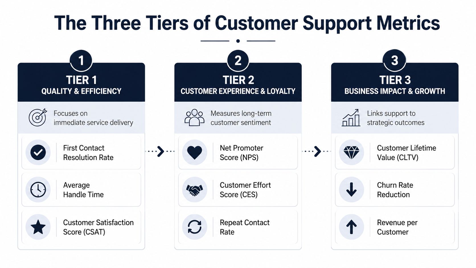
The cleanest way to make customer support metrics useful is to sort them by what decisions they support. A flat list turns everything into a KPI. A tiered model shows which metrics describe service quality, which describe customer friction, and which belong in business planning.
Tier 1 quality and efficiency
These metrics describe what happened inside the support interaction itself. They help managers run the team day to day.
For SaaS teams, First Contact Resolution, or FCR, is one of the most useful metrics because it captures whether the customer got a durable answer on the first try. For mature SaaS teams in 2026, FCR benchmarks are projected to fall in the 70 to 80 percent range, while complex technical support is projected to target 60 to 70 percent. The same benchmark source links strong FCR performance with an 88 percent potential CSAT when live chat First Response Time is under 2 to 3 minutes according to EasyDesk's support benchmark data.
That gives you a strong operational signal. Fast first response matters, but not in isolation. It matters because it supports effective resolution and shapes perceived quality.
Below are the Tier 1 metrics I'd put on every support manager dashboard:
| Metric | Tier | What It Measures | Common Formula |
|---|---|---|---|
| First Contact Resolution Rate | Tier 1 | Whether issues are solved in the first interaction | Resolved on first contact / Total cases |
| Average Handle Time | Tier 1 | Time spent handling an interaction | Total handling time / Total interactions |
| First Response Time | Tier 1 | Time from customer contact to first reply | Total first response time / Total new tickets |
| Customer Satisfaction Score | Tier 1 | Customer rating of a completed interaction | Positive survey responses / Total survey responses |
A few cautions matter here:
- FRT isn't resolution: A fast reply can still produce a poor experience if the answer is generic or requires multiple follow-ups.
- AHT isn't productivity: Lower handle time may reflect better workflows, but it can also reflect rushed interactions.
- CSAT isn't loyalty: It measures satisfaction with an episode, not with the product relationship overall.
Tier 2 customer experience and loyalty
Tier 2 metrics move beyond the ticket and into customer perception. These are the measures that tell you whether support feels easy, frustrating, or confidence-building.
Customer Effort Score, or CES, is especially important because it captures friction from the user's perspective. In the benchmark guidance cited earlier, maintaining CES above 5.5 on a 7-point scale is treated as the technical standard for interactions that sustain loyalty. That's a useful threshold because it forces teams to evaluate whether "efficient" processes feel easy to customers.
Other metrics in this tier include:
- Net Promoter Score: A broad sentiment signal about the relationship with the company.
- Repeat Contact Rate: Whether customers must come back about the same issue.
- Reopen Rate: Whether a solved ticket was properly solved.
Support teams often overvalue visible speed and undervalue invisible effort. Customers remember whether solving the issue felt easy, not whether an agent replied quickly with a template.
Tier 2 metrics are where false positives show up. A team can look operationally healthy in Tier 1 while accumulating friction in Tier 2. That's the classic pattern behind support organizations that look efficient internally but contribute to churn externally.
Tier 3 business impact and growth
Tier 3 is where support data becomes strategy. These metrics connect service performance to retention, expansion, and cost structure.
Common metrics in this tier include:
- Escalation Rate: How often frontline support can't finish the job
- Cost per Resolution: The unit economics of solving customer problems
- Backlog Risk by Segment: Open issue concentration among important accounts
- Revenue per Affected Customer: The business value tied to recurring support themes
- Churn Risk by Issue Type: Whether certain complaints cluster among vulnerable accounts
This tier is often missing from support reporting because it requires joining systems that weren't designed to talk to each other. Ticketing tools know what happened. CRM systems know who the customer is. Billing systems know contract value. Product analytics knows whether the account is engaged. When you connect those layers, support stops being a cost center spreadsheet and becomes a leading indicator of business health.
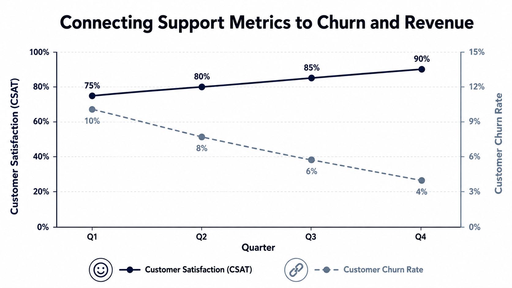
Connecting Support Metrics to Churn and Revenue
Support leaders usually know which queues are overloaded. They usually know which agents are stretched. Fewer know how to answer a harder question: which support patterns should trigger intervention from product, customer success, or finance?
That's where the metric stack changes. Once you map support events to account value and customer outcomes, the support queue becomes an early warning system.
Start with issue concentration, not averages
Averages flatten risk. A company-wide CSAT score can look stable while one plan tier or one product area deteriorates.
The better question is narrower. Which customers are generating the complaints? If repeat contacts, poor satisfaction, or long resolution patterns are concentrated in enterprise accounts, new customers, or users of a specific feature, the issue isn't operational noise. It's targeted revenue exposure.
That framing also changes how you think about churn. Churn rarely starts as a cancellation event. It starts as unresolved friction. The support team often sees it first.
A useful operating model is:
- Classify the issue by product area, workflow, or root cause.
- Attach account context such as plan, contract value, lifecycle stage, or renewal timing.
- Track related support signals like repeat contacts, escalations, and negative satisfaction.
- Escalate based on business impact, not just ticket count.
Translate support trends into financial language
Most support teams still report in service terms. Product and finance teams need business terms.
Instead of saying, "Tickets about onboarding are up," say, "Onboarding friction is clustering among newly activated accounts and is delaying adoption." Instead of saying, "AHT increased," say, "Agents now need multiple touches to resolve this issue, which raises service cost and suggests a broken workflow."
The gap between those two ways of reporting is exactly what many guides miss. Gorgias highlights that teams rarely quantify how improvements in standard support metrics connect to retention or expansion value. That missing layer is why support often gets treated as overhead rather than insight.
Executive lens: A support issue becomes strategic when it predicts lost renewals, delayed expansion, or rising service cost in a meaningful customer segment.
If you want a broader framework for tying operational signals to account health, this guide to reducing churn rate with better signal detection is useful because it frames churn as a pattern recognition problem, not just a success team problem.
What this looks like in practice
Consider three examples:
- Recurring setup confusion: If new customers repeatedly contact support during implementation, that likely points to documentation or UX debt. The cost isn't just ticket load. It's slower activation and weaker adoption.
- Escalations tied to one feature: If tickets involving a feature routinely require engineering help, that feature has a hidden support tax and a product quality problem.
- Negative sentiment from high-value accounts: If large accounts express frustration about reliability or permissions, even a small cluster deserves leadership attention because those customers carry outsized retention value.
The underlying point is simple. Customer support metrics matter most when they help the business estimate consequence. Without that, teams are optimizing process. With it, they're managing risk and growth.
How to Prioritize Your Customer Support Metrics
Not every metric deserves equal attention. A support team that treats all KPIs as equally important usually ends up reacting to the loudest chart on the dashboard.
Prioritization should follow company context. The right metric mix depends on product complexity, service model, account value, and where the company is trying to grow. An early-stage SaaS company may care most about fast first replies and clear onboarding support because early trust matters. A larger platform with established volume may care more about repeat contact, escalations, and the cost of resolution because scale exposes inefficiency.
Pick one operational anchor and one business anchor
Teams generally need two anchor metrics, not ten.
The first should be an operational anchor. This is the number that helps the support org run cleanly. Depending on your environment, that might be FCR, first response time, or backlog health.
The second should be a business anchor. This is the metric that connects support quality to company outcomes. In many SaaS environments, that means customer effort, repeat contact, or issue concentration by segment.
A practical pairing might look like this:
- High-volume transactional support: First response time plus repeat contact rate
- Complex technical support: First contact resolution plus escalation rate
- Enterprise SaaS support: Customer effort plus issue concentration in strategic accounts
- Automation-heavy support: Containment rate plus CSAT or CES stability
The pitfall for many AI programs lies in this: Teams celebrate containment because it lowers workload, but they don't always check whether the customer got a durable answer.
Balance automation with effort
In AI-driven support, efficiency only counts if customers don't feel the system is pushing work back onto them. The benchmark guidance from BlueTweak's customer support metrics analysis makes that tradeoff explicit. The optimal balance is a containment rate that keeps CES above 5.5 while reducing AHT by 20 to 30 percent. If AI fails to resolve issues correctly, repeat contacts and escalations rise, which erases the efficiency gain.
That's the right way to evaluate automation. Not by asking, "Did the bot deflect tickets?" Ask, "Did automation reduce effort without creating downstream work?"
Automation should remove friction from the customer's path. If it only removes labor from the support team's side, it won't hold.
Use maturity, complexity, and consequence as filters
When deciding what to prioritize, I use three filters.
Maturity: Is the team still building basic responsiveness, or has it already stabilized service delivery?
Complexity: Are most issues simple and repeatable, or technical and cross-functional?
Consequence: Which failures create the most business damage when they go unresolved?
Those filters help you avoid KPI bloat. They also make outside benchmarking more useful. Resources like IllumiChat's KPI insights can help teams compare metric categories and definitions, but the important move is still local prioritization. A benchmark should inform your operating standard, not replace your strategy.
Building a Real-Time Support Metrics Dashboard
A good dashboard doesn't summarize everything. It shortens the distance between signal and action.
Most support dashboards fail because they mix audiences. Executives, support managers, and product teams don't need the same view. When everyone gets the same screen, nobody gets the context required to act.
Build separate views for separate decisions
An executive dashboard should be sparse. It should answer questions like:
- Which issues are creating the most business risk
- Which customer segments show rising support friction
- Where is support cost growing because product quality is weak
- Which patterns deserve cross-functional escalation
A support manager dashboard should be more tactical. It should show queue health, agent workload, resolution patterns, and emerging anomalies by channel or issue type.
A product-facing dashboard should look different again. Product managers don't need every service metric. They need trend lines by bug cluster, workflow confusion, repeated feature requests, and issue severity by customer segment.
Alerts need context, not just thresholds
Teams waste time on generic alerts because generic alerts don't tell anyone what changed or why it matters.
A weak alert says CSAT dropped. A useful alert says satisfaction dropped among customers using a specific workflow, or escalations increased for a product area tied to upcoming renewals. That kind of context speeds up investigation because it narrows the surface area immediately.
This is why real-time analytics matters. If your reporting runs on delayed exports and weekly spreadsheet reviews, you'll always detect patterns after customers have already absorbed the frustration. A stronger model pulls support, product, and account data into one live view, similar to the operating principles behind real-time data analytics for customer-facing teams.
Design for triage first, analysis second
A dashboard should help teams answer three questions quickly:
- What changed
- Who is affected
- What action should happen next
That sounds obvious, but many dashboards are built for passive consumption. They display history well and drive action poorly.
A better design includes drill-downs from summary metrics into ticket themes, customer segments, and linked workflows. The first layer surfaces anomalies. The next layer shows root cause evidence. The final layer routes ownership.
Video can help teams align on what a live, decision-oriented system looks like in practice.
The best dashboard isn't the one with the most charts. It's the one that makes the next decision obvious.
How to Operationalize Insights from Your Metrics
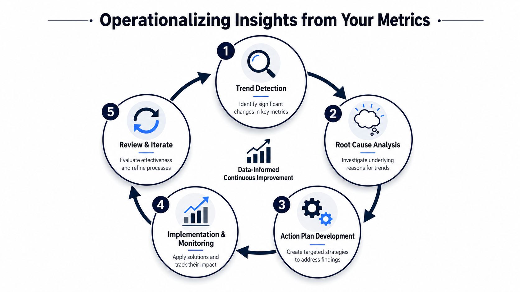
A metric only matters when it changes behavior. If a trend shows up on Monday and nobody owns the response by Friday, the reporting system is decorative.
The strongest support organizations build a workflow where signal moves automatically from detection to action. That process doesn't need to be flashy. It needs to be reliable.
A workable operating loop
Here's the pattern that scales:
- Detect the changeSupport metrics surface a shift. Handle time rises for a ticket category. Repeats increase for one workflow. Satisfaction weakens in a specific account segment.
- Review the underlying conversationsManagers or analysts read the actual tickets, chat logs, and notes behind the trend. Through this reading, the root cause becomes clear. The metric shows where to look. The conversation explains why.
- Assign the right ownerNot every support issue belongs to support. Some belong to product, onboarding, docs, billing, or customer success.
- Create a business-backed taskThe handoff should include impact, not just description. A product ticket is stronger when it includes the issue pattern, affected customers, and business priority.
- Monitor the post-fix effectAfter the change ships, the team watches whether effort, repeats, escalations, or sentiment improve.
Make the handoff usable
Most cross-functional workflows break at the handoff point. Support sends anecdotal feedback. Product asks for proof. Engineering asks for reproduction steps. Customer success asks which accounts are affected. The issue stalls because no one receives a complete case.
A better handoff package includes:
- Issue summary: Clear description of the failure or friction
- Evidence set: Representative support conversations
- Pattern scope: Which issue type, workflow, or feature is involved
- Customer context: Segment, plan, or lifecycle stage affected
- Recommended owner: Product, engineering, docs, onboarding, or success
This is also where operational analytics inside tools like Zendesk become more valuable when paired with process discipline. For teams refining that layer, LicenseTrim's Zendesk analytics insights offer a useful view of how support data can be organized for better decision-making.
Close the loop publicly
A support organization gets sharper when resolved issues are visible across teams. Product should know which support patterns were fixed. Support should know which escalations led to changes. Leadership should know which recurring problems were eliminated versus repeatedly triaged.
That shared visibility does two things. It improves trust between teams, and it helps everyone distinguish random noise from recurring product debt.
Operating principle: Don't just measure the queue. Measure whether the business learns from the queue.
From Scorekeeping to Strategic Growth
Customer support metrics become valuable when they stop acting as isolated service KPIs and start working as business instruments. FRT, FCR, CES, escalation rate, and containment rate all matter. But they matter for different reasons, and only some belong in strategic planning.
The shift is subtle but important. You're no longer asking whether support handled tickets efficiently. You're asking which patterns predict churn, which friction blocks expansion, and which recurring issues should change the product roadmap.
That change also reframes support's role. Support isn't just there to absorb problems after customers hit them. It's there to expose the most expensive friction in the business, early enough for the company to act.
For teams expanding their ROI thinking beyond ticket operations, it also helps to calculate community ROI when support communities, self-service, and peer help reduce repetitive load while strengthening retention.
The companies that win here don't build the biggest dashboard. They build a system where customer pain becomes quantified evidence, evidence becomes priority, and priority becomes product and revenue action.
If you want to turn support conversations into revenue-prioritized product intelligence, SigOS helps teams identify the issues tied to churn, expansion, and customer value so product, growth, and support can act on the right signals faster.
Keep Reading
More insights from our blog

Ready to find your hidden revenue leaks?
Start analyzing your customer feedback and discover insights that drive revenue.
Start Free Trial →