Customer Success Metrics a Guide to Driving Revenue
Master the customer success metrics that matter. Our guide covers NRR, churn, and CLTV, showing how to calculate, interpret, and act on data to reduce churn.

You're probably looking at a dashboard that says things are fine.
CSAT is high. Support volume is stable. A few accounts even left positive comments. Then finance flags contraction, leadership asks about renewal risk, and someone points out that churn has been creeping in from accounts that never looked urgent.
That's the trap. Many customer success metrics describe activity after the fact. They make a team look busy, even competent, while missing the one question executives care about: are customers getting enough value to stay and spend more?
The strongest customer success teams don't treat metrics as service reporting. They treat them as revenue instrumentation. That means tracking the measures that connect customer behavior to retention, expansion, and timing. It also means accepting that no dashboard tells the full story on its own. The number tells you what moved. The feedback tells you why.
A lot of teams that are refining their retention motion also revisit adjacent strategies for B2B growth because customer success rarely operates in isolation. Pricing, onboarding, product adoption, support quality, and executive alignment all show up later in the metrics.
Beyond CSAT The Real Meaning of Customer Success
A familiar leadership meeting goes like this. The customer success leader shares strong satisfaction scores, shows closed-loop follow-up on unhappy responses, and points to a full slate of QBRs and onboarding completions. The CEO listens, then asks a harder question: if customers are so satisfied, why are renewals under pressure?
That question gets to the essential meaning of customer success.
Customer success isn't the same as customer happiness. It's not the same as support efficiency either. It's whether customers reach outcomes that make renewal feel obvious and expansion feel justified. If the commercial result isn't there, the metric stack is incomplete.
What traditional reporting gets wrong
Teams often overweight metrics that are easy to collect.
They track survey response rates, average ticket handle times, meeting counts, and training attendance. Those can be useful operating signals, but they become vanity metrics when they're disconnected from adoption and commercial performance.
A satisfied customer who isn't using the product is still a churn risk.
That's why modern customer success has moved away from a narrow satisfaction lens. The function now sits much closer to revenue than many org charts admit. The best metrics tell you whether onboarding is working, whether product usage is deepening, whether support friction is manageable, and whether that combined experience is producing retained recurring revenue.
What the dashboard should answer
A practical customer success dashboard should help you answer four questions:
- Are customers staying
- Are they expanding
- Are they reaching value quickly
- Do we understand the reason behind risk before renewal is at stake
If your reporting can't answer all four, you're still measuring service quality more than customer success.
That's the shift that matters. Customer success metrics aren't there to prove your team worked hard. They're there to help the company intervene earlier, allocate resources better, and protect revenue before the renewal forecast gets revised downward.
The Core Customer Success Metrics You Must Track
Some metrics matter because they feel useful. Others matter because they tell you whether the business is durable.
The second category deserves most of your attention. Industry guidance defines strong SaaS performance with NRR above 110%, annual churn below 5%, a customer health score above 70/100, and time to value under 30 days, which reflects the operating logic that retention and expansion are core financial levers, not side outcomes of good service (GurusUp customer success metrics guidance).
Three metric groups that actually matter
I'd group customer success metrics into three buckets.
Retention and revenue
These are executive metrics. They tell you whether your customer base is becoming more valuable over time or leaking revenue.
- Net revenue retention shows whether existing customer revenue is holding, shrinking, or growing after churn, contraction, and expansion.
- Churn tells you how much business you're losing. In practice, teams often track logo churn and revenue churn separately because the stories differ.
- Expansion revenue shows whether customers are buying more after initial adoption.
- Lifetime value helps you judge the long-term commercial value of retained customers.
Product engagement
These are operating metrics. They tell you whether customers are behaving like people who will renew.
- Time to value captures how quickly customers reach a meaningful outcome.
- Feature adoption shows whether they're using the parts of the product tied to stickiness.
- Usage depth and consistency usually reveal risk earlier than survey sentiment.
- Health score combines multiple signals into one prioritization layer.
Voice of customer
These metrics are useful, but they're often misunderstood.
- CSAT is good for measuring a specific interaction.
- NPS is better treated as directional relationship feedback than as a churn model.
- Qualitative feedback from tickets, calls, and chats often carries the most operational value because it explains the movement behind the number.
Practical rule: If a metric can't trigger a concrete action, it belongs on a report, not in your core operating set.
Key Customer Success Metrics at a Glance
| Metric | Formula | What It Measures | Good Benchmark |
|---|---|---|---|
| Net Revenue Retention | Revenue at period end from existing customers, including expansion and excluding new business, divided by starting revenue | Whether the installed base is growing or shrinking | Above 110% |
| Annual Churn | Customers or revenue lost over the year divided by the starting base | Loss of customers or recurring revenue | Below 5% |
| Expansion Revenue | Additional revenue from existing customers through upsell, cross-sell, or seat growth | Growth from the current base | Qualitative benchmark, compare by segment and period |
| Customer Health Score | Weighted combination of usage, support, and business outcome signals | Overall account risk or opportunity | Above 70/100 |
| Time to Value | Time from purchase or kickoff to first meaningful outcome | Speed of activation and onboarding effectiveness | Under 30 days |
| Feature Adoption | Share of customers or accounts using key product capabilities | Depth of product value realization | Qualitative benchmark, define by role and segment |
| CSAT | Satisfaction score from interaction-level surveys | Reaction to a support or service experience | Often 80% to 90% in industry guidance |
| Customer Effort Score | Post-interaction ease rating | Friction in support or workflows | Often above 5.0 |
| First Contact Resolution | Issues resolved on first interaction divided by total issues | Support effectiveness and ease | Often 75% to 85% |
What works and what doesn't
What works is a small set of customer success metrics with clear ownership.
What doesn't work is a bloated dashboard where every team gets its favorite KPI and nobody knows which signal outranks the others. When that happens, churn becomes a postmortem exercise. The team can explain the loss, but it can't predict it.
A better system starts with retention and expansion, then works backward into the usage, support, and feedback signals most likely to move those outcomes.
How to Calculate and Benchmark Key Financial Metrics
The finance-heavy terms scare people more than the math itself. Most of the confusion comes from inconsistent definitions, not complexity.
If you want customer success metrics to influence budget and headcount decisions, your formulas need to be stable, easy to explain, and shared with finance.

Net revenue retention
Start with the recurring revenue from customers you already had at the beginning of the period. Then account for what happened inside that group: churned revenue, downgraded revenue, and expanded revenue. Don't include new logo revenue.
In plain terms, NRR answers this: if sales stopped bringing in new customers for a while, would the installed base still hold or grow?
If your NRR is above the strong benchmark covered earlier, your existing base is doing real work for the business. If it isn't, a lot of “healthy” account activity may be hiding weak adoption or weak pricing power.
Churn and MRR loss
Churn becomes useful when you stop treating it as one number.
Look at:
- Logo churn when you want to understand account loss patterns
- Revenue churn when you want to understand financial damage
- Contraction churn when customers stay but spend less
That distinction matters. A business can keep revenue relatively stable while losing smaller accounts steadily. It can also preserve logos while giving away too much value through downgrades.
If you're auditing recurring spend on support tooling as part of this exercise, operational cleanup like identifying wasted Zendesk licenses can help separate true customer retention investment from avoidable software overhead.
Customer lifetime value
Lifetime value gets messy when teams overengineer it. Start simple. Estimate the total economic value of a customer relationship based on recurring revenue, expected retention, and expansion behavior.
A practical overview of the inputs is in this guide to calculating SaaS lifetime value.
The point of CLTV isn't theoretical precision. It's resource allocation. If you know which segments produce durable value, you can decide where high-touch success makes sense, where automation is enough, and where onboarding needs redesign.
Finance doesn't need your metric to be perfect. It needs your definition to stay consistent.
Benchmarking without fooling yourself
Benchmarking should sharpen judgment, not replace it.
Use external standards as a directional check. Then compare performance by segment, plan, lifecycle stage, and onboarding path. An enterprise implementation motion and a self-serve product don't behave the same way, so they shouldn't inherit the same target logic.
The most useful benchmark is often your own recent history. If time to value is drifting longer, if contraction is appearing earlier in the lifecycle, or if expansion clusters only in one segment, those patterns are usually more actionable than broad industry comparisons.
Building a Predictive Customer Health Score
A customer health score is valuable only if it helps a team act before the renewal is in play.
That's why single-input health models usually fail. If your score is mostly based on NPS, executive sponsorship, or a CSM's account notes, it may describe the relationship but miss the behavior. A predictive score needs multiple signals, weighted on purpose.
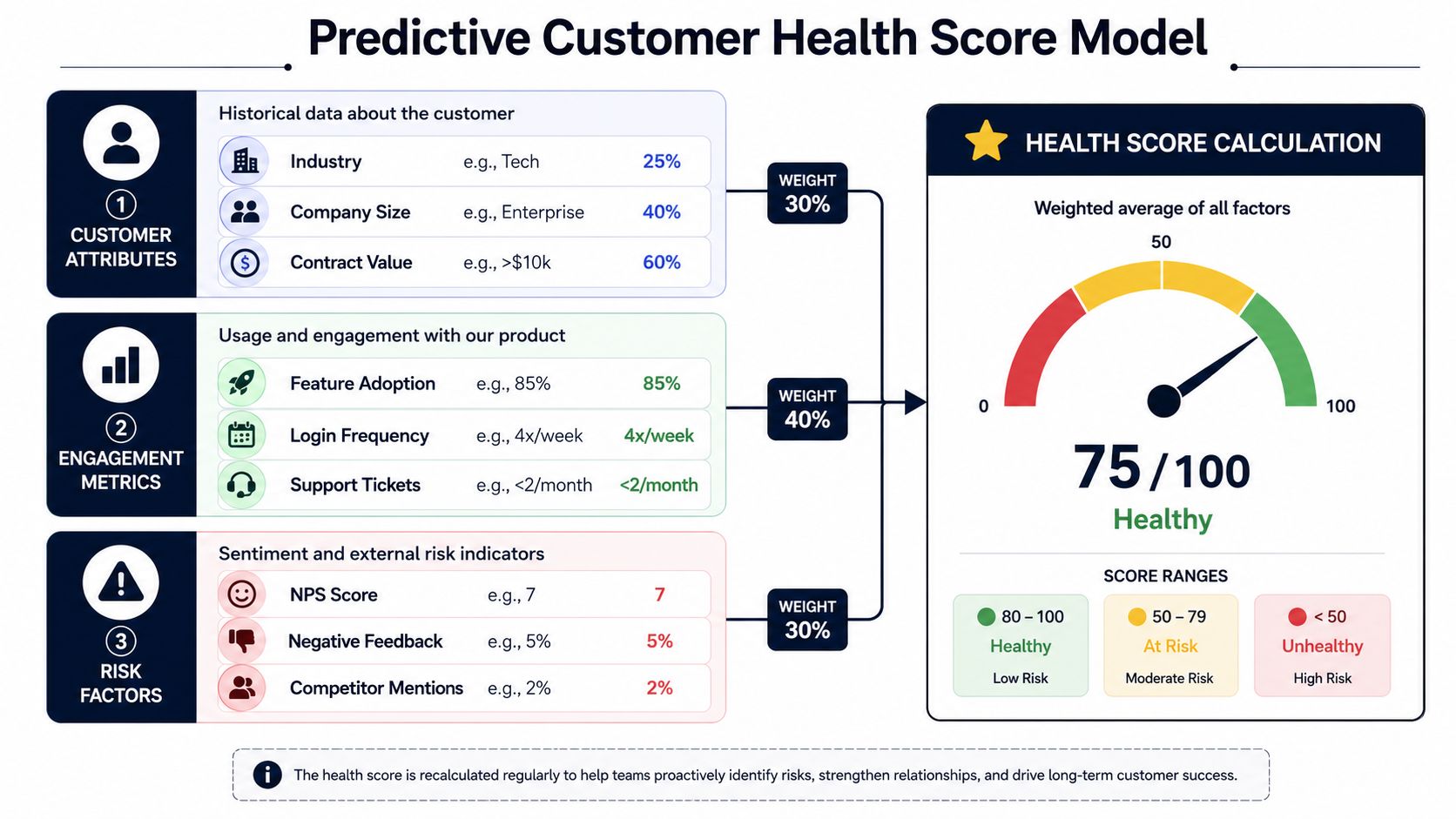
A practical weighting model
A common approach weights product usage at 40%, support health at 30%, and business results at 30%, then tiers accounts into Green for 80 to 100, Yellow for 50 to 79, and Red below 50 to identify both risk and expansion opportunity (HubSpot customer success metrics model).
That framework works because it mixes three different realities:
- Behavioral reality through usage and feature adoption
- Operational reality through support quality, friction, and unresolved issues
- Commercial reality through outcome achievement, renewals, and growth potential
Here's the video version if you want a visual walkthrough of the concept.
What should go into each layer
Usage signals
This should carry the most weight in most SaaS models.
Look at consistency, depth, and role-based adoption. A customer logging in regularly but using only one shallow feature can still be fragile. A customer rolling usage across teams is usually harder to displace.
Support health
This doesn't mean ticket volume is bad by itself.
Complex customers often submit more tickets because they're active. What matters is the pattern. Repeated issues, unresolved escalations, high-friction workflows, and recurring complaints around the same blocker usually deserve a penalty in the score.
Business results
In this context, teams often get lazy because it's harder to standardize.
You need a proxy for whether the customer is getting the outcome they bought the product for. That may come from milestone completion, renewal posture, use-case maturity, or stakeholder feedback captured in account reviews.
How to use the score operationally
A health score isn't for the slide deck. It's for queue prioritization.
- Green accounts should trigger expansion discovery, advocacy asks, and broader adoption plays.
- Yellow accounts need a targeted check-in, usually around adoption friction or delayed outcomes.
- Red accounts need fast intervention with clear ownership across CS, support, and product when needed.
A deeper discussion of model design is in this article on predictive churn modeling.
Don't ask whether your health score is sophisticated. Ask whether it changes who your team calls first on Monday morning.
Turning Metrics into Action with CS Playbooks
Most dashboards fail at the same point. They surface risk, then leave the team to improvise.
That's expensive. Good customer success metrics only become useful when they trigger repeatable actions. The playbook is the missing link between observation and outcome.
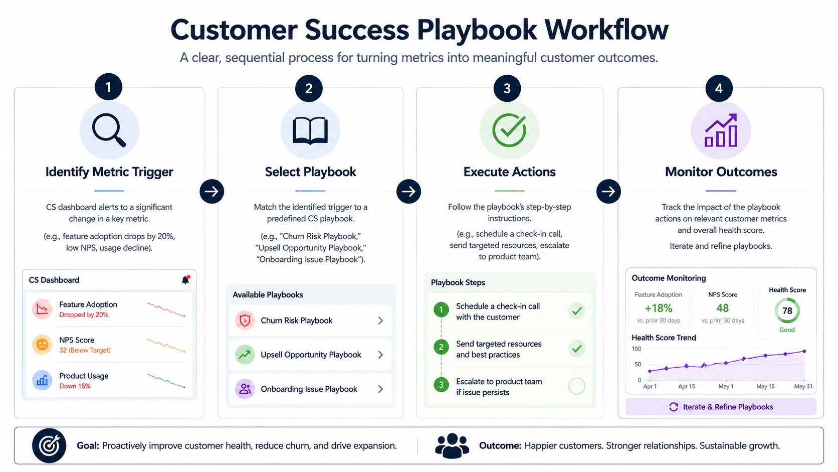
Red account turnaround
This playbook starts when an account slips into a risk state through declining usage, recurring support friction, or an abrupt drop in engagement.
The objective isn't “save the customer” in a vague sense. It's to identify the blocked outcome and remove it fast.
A practical version looks like this:
- Confirm the trigger. Check the score components, recent tickets, usage trend, and upcoming renewal date.
- Name the likely failure point. Onboarding gap, missing feature adoption, unresolved issue, or stakeholder disengagement.
- Set one recovery path. Don't throw five asks at the customer. Pick the shortest route back to value.
- Review within a tight cadence. If the account doesn't move, escalate.
Expansion opportunity
A different motion applies when an account is healthy and active.
These accounts don't need a generic “checking in” email. They need a value expansion conversation tied to evidence. If usage is broadening, if a team has adopted multiple workflows, or if internal champions are emerging, customer success should coordinate with sales around timing and narrative.
The best expansion playbooks don't start with pricing. They start with proof that the customer is already behaving like a bigger customer.
Useful inputs here include adoption depth, support history, stakeholder engagement, and any product feedback that points to adjacent use cases.
New customer onboarding
For new customers, the key metric is rarely a survey. It's whether they reach a meaningful first outcome quickly enough to build momentum.
An onboarding playbook should focus on:
- First milestone clarity rather than feature tours
- Role-based enablement rather than generic training
- Early usage verification rather than assuming kickoff attendance equals adoption
- Fast escalation paths when implementation blockers appear
What works is a narrow path to value. What doesn't work is handing the customer a long enablement library and hoping they self-assemble success.
Make playbooks measurable
Each playbook needs one owner, one trigger, and one success condition.
If the trigger is clear but the team debates what to do next, the process isn't operationalized. If the actions happen but no one measures whether the account recovered, the team is just performing activity.
Customer success metrics should decide the next move automatically often enough that the team spends its energy on customer judgment, not internal guesswork.
Uncovering the Why Behind Your Numbers
A dashboard can tell you that health dropped, feature adoption stalled, or churn risk increased. It usually can't tell you why.
That gap matters most in low-touch and product-led SaaS, where human coverage is lighter and survey response is patchy. In those environments, product usage and feature adoption are more reliable indicators than surveys, and over-reliance on satisfaction scores can hide behavioral disengagement. The deeper reason behind movement often sits in behavioral and qualitative data, not just surveys (ClientSuccess on low-touch customer success metrics).
Why survey-led CS misses risk
A customer can report being satisfied and still be drifting out of the product.
That happens all the time. The buyer likes the vendor. Support has been responsive. Nobody is upset enough to leave negative feedback. Meanwhile, the day-to-day users have stopped building habits, key workflows are underused, and the account is gradually becoming optional.
That's why CSAT and NPS are weak as standalone prediction tools. They're lagging and selective. They capture an opinion from some customers at some moments. They don't reliably capture avoided workflows, hidden friction, or repeated internal workarounds.
Where the real explanations live
The “why” usually hides in unstructured sources:
- Support tickets that mention the same blocker in different language
- Chat logs where customers explain what they tried before asking for help
- Sales call transcripts that reveal promised use cases versus actual adoption
- Feature requests that point to missing capability or market fit gaps
- Success notes where CSMs record stakeholder changes or political risk
None of those sources are easy to summarize manually at scale. That's why many teams know their numbers but still struggle to act on them with confidence.
If ten customers ask for the same thing in ten different ways, the spreadsheet won't show you the pattern unless someone translates the language first.
Quantitative metrics still matter
This isn't an argument against measurement. It's an argument against stopping at measurement.
Use the metrics to flag movement. Then use qualitative evidence to explain the movement. When those two layers stay separate, teams make slower decisions and often fix the wrong problem. They add outreach when the actual issue is product friction. They blame onboarding when the problem is a broken workflow. They chase detractors while ignoring disengaged accounts that never answered a survey at all.
The most mature customer success practice combines both views. The numbers tell you where to look. The feedback tells you what to do.
Your Modern Customer Success Dashboard
A modern dashboard shouldn't feel like a report card. It should work like a command center.
That means it needs a small set of outcome metrics, a layer of leading indicators, and enough context to explain movement without forcing the team to open five different systems.
What belongs on the screen
For most SaaS teams, the dashboard should center on:
- Retention and expansion outcomes so leadership can see whether the customer base is strengthening
- Health score movement by segment so managers can allocate attention
- Time-to-value and adoption trendlines so onboarding and product teams can spot friction
- Support friction indicators tied to accounts, not just queue performance
- Qualitative themes that explain why risk or opportunity is forming
The reporting cadence should also differ by role. CSMs need near-real-time alerts on risk changes. Managers need weekly trend reviews by segment. Executives need a monthly summary that connects customer success metrics to revenue posture.
Why qualitative insight has to be embedded
Without qualitative context, the dashboard stays reactive.
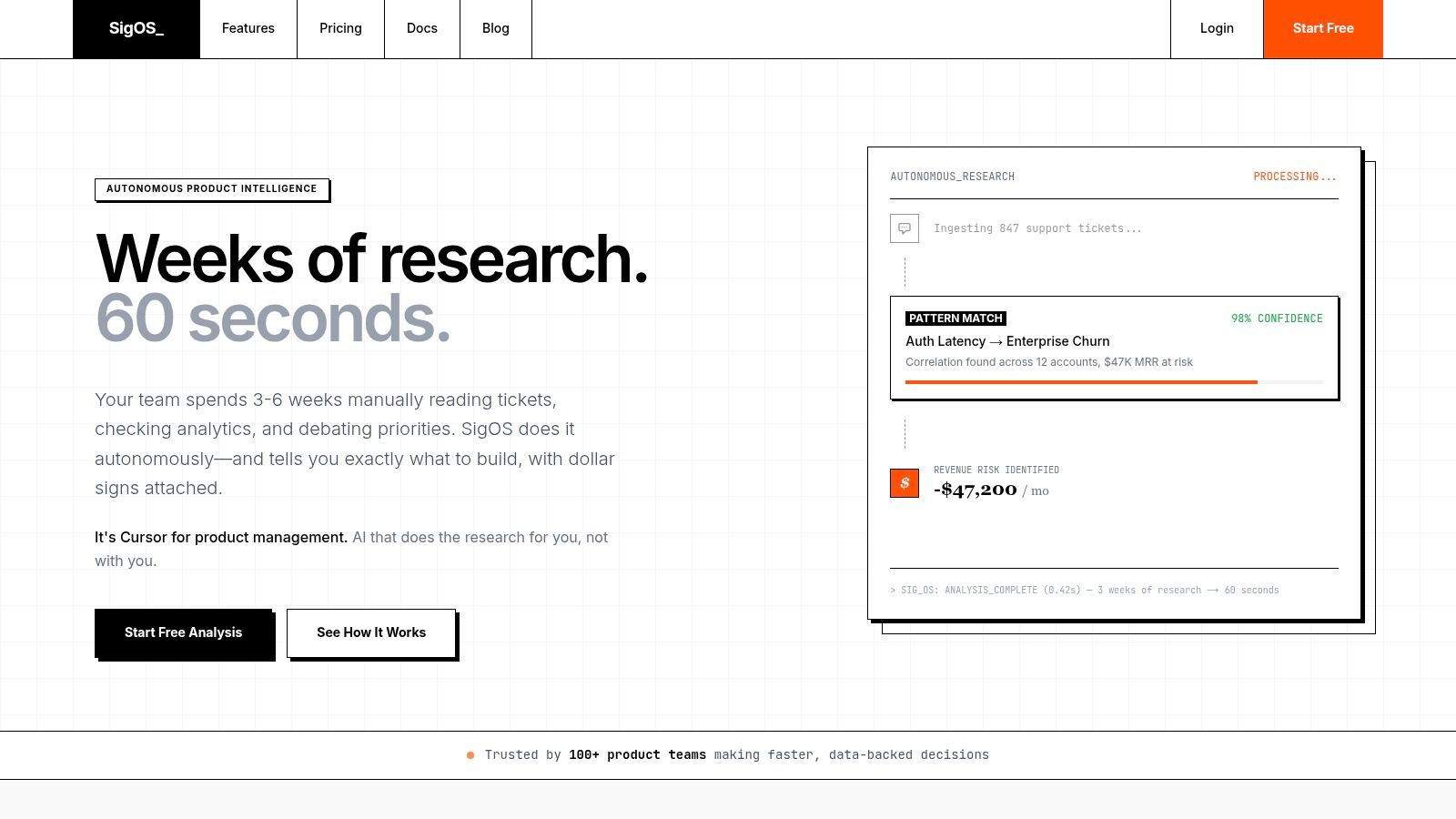
Product intelligence platforms can add something useful. Tools that ingest tickets, transcripts, chat, and usage data can connect recurring feedback themes to churn or expansion signals. One option is SigOS, which analyzes those sources and surfaces patterns tied to revenue impact so teams can prioritize issues and feature requests with clearer commercial context.
A useful dashboard also needs drill-down paths. A red health score by itself is not actionable. A red score linked to repeated workflow complaints, declining usage in a key feature, and an unresolved product issue is actionable.
If you're designing that reporting layer, this guide to a dashboard for metrics is a practical starting point.
What to remove
Many teams need fewer widgets, not more.
Remove metrics that don't change decisions. Remove charts that summarize activity with no tie to retention. Remove vanity survey reporting that makes the team feel informed while hiding behavior.
The best dashboards create tension in the right place. They make it obvious where revenue is at risk, where growth can come from, and what the underlying customer feedback is saying about both.
If your current reporting tells you what happened but not why it happened, SigOS is worth a look. It connects support tickets, chat transcripts, sales calls, and usage data so product, customer success, and growth teams can prioritize the issues and requests most closely tied to churn risk, expansion potential, and revenue impact.


Ready to find your hidden revenue leaks?
Start analyzing your customer feedback and discover insights that drive revenue.
Start Free Trial →