Understanding Correlation Analysis for Product Teams
A guide to understanding correlation analysis. Learn to find signals in your product data, avoid common pitfalls like causation confusion, and drive revenue.

Your dashboard is full of signals that don't agree with each other. Support says billing complaints are rising. Growth says activation looks healthy. Customer success says accounts mentioning integrations are harder to renew. Product analytics shows strong feature usage, but churn still lands where you don't expect it.
That's the point where many product teams stop trusting the data. Not because the data is useless, but because it's noisy.
Understanding correlation analysis helps you sort that noise into something usable. It gives you a disciplined way to ask, “When this pattern appears, what other business outcome tends to move with it?” For a product manager, that can mean connecting support themes to churn risk, onboarding behavior to expansion, or adoption of a workflow to retention.
Used well, correlation analysis is practical. It helps teams prioritize what matters. Used badly, it sends teams chasing ghosts.
Finding the Signal in Your Product Data
A familiar product meeting goes like this. One person brings a spreadsheet of feature requests. Another shares a pile of Zendesk tags. Someone else points to declining conversion in a single cohort. Everyone has evidence, and nobody agrees on what deserves engineering time first.
Correlation analysis is useful here because it looks for consistent relationships between variables. In plain English, it helps you test whether two things tend to move together. That might be “number of onboarding errors and trial conversion,” or “mentions of export issues and account downgrade risk.”
Why product teams need it
Product data rarely arrives in a clean lab environment. It arrives through usage logs, support tickets, sales call notes, NPS responses, and CRM updates. If you don't have a disciplined way to connect those dots, prioritization turns into opinion.
That's also why teams often pair this thinking with workflow analysis. If you're trying to understand where customer friction enters the journey, a practical guide to process optimization can help you map the path before you test which steps correlate with churn or expansion.
There's a less glamorous requirement too. Correlation only helps if the underlying inputs are trustworthy. Bad joins, duplicate records, drifting event names, and missing fields can create false patterns, which is why teams should treat data quality issues as an analysis problem, not just an engineering cleanup task.
Correlation analysis doesn't replace product judgment. It gives product judgment a firmer footing.
A method with old roots and modern uses
This isn't a trendy invention from dashboard culture. The modern statistical framework began in the late nineteenth century, with Karl Pearson presenting the now-standard correlation formula to the Royal Society in England in November 1895 (historical reference).
That history matters because the core problem hasn't changed. Teams still need a reliable way to move from “these two things seem related” to “we can measure how closely they move together.”
In product work, that shift is valuable. It turns vague statements like “customers who complain about reporting probably churn more” into testable questions. Once you frame the question correctly, you can start deciding whether a bug fix, onboarding change, or packaging update deserves real priority.
What Exactly Is Correlation Analysis
Correlation analysis measures how closely two variables move in relation to each other. If one rises when the other rises, that's a positive correlation. If one rises when the other falls, that's a negative correlation. If they move independently, there may be little or no correlation.
A thermostat analogy usually makes this click.
If room temperature drops, heater use goes up. Those two move in opposite directions, so that's a negative correlation. If outside temperature rises and ice cream sales rise too, that's a positive correlation. If the number of support tickets on Tuesday has no clear relationship to your CEO's coffee intake, that's effectively no correlation.
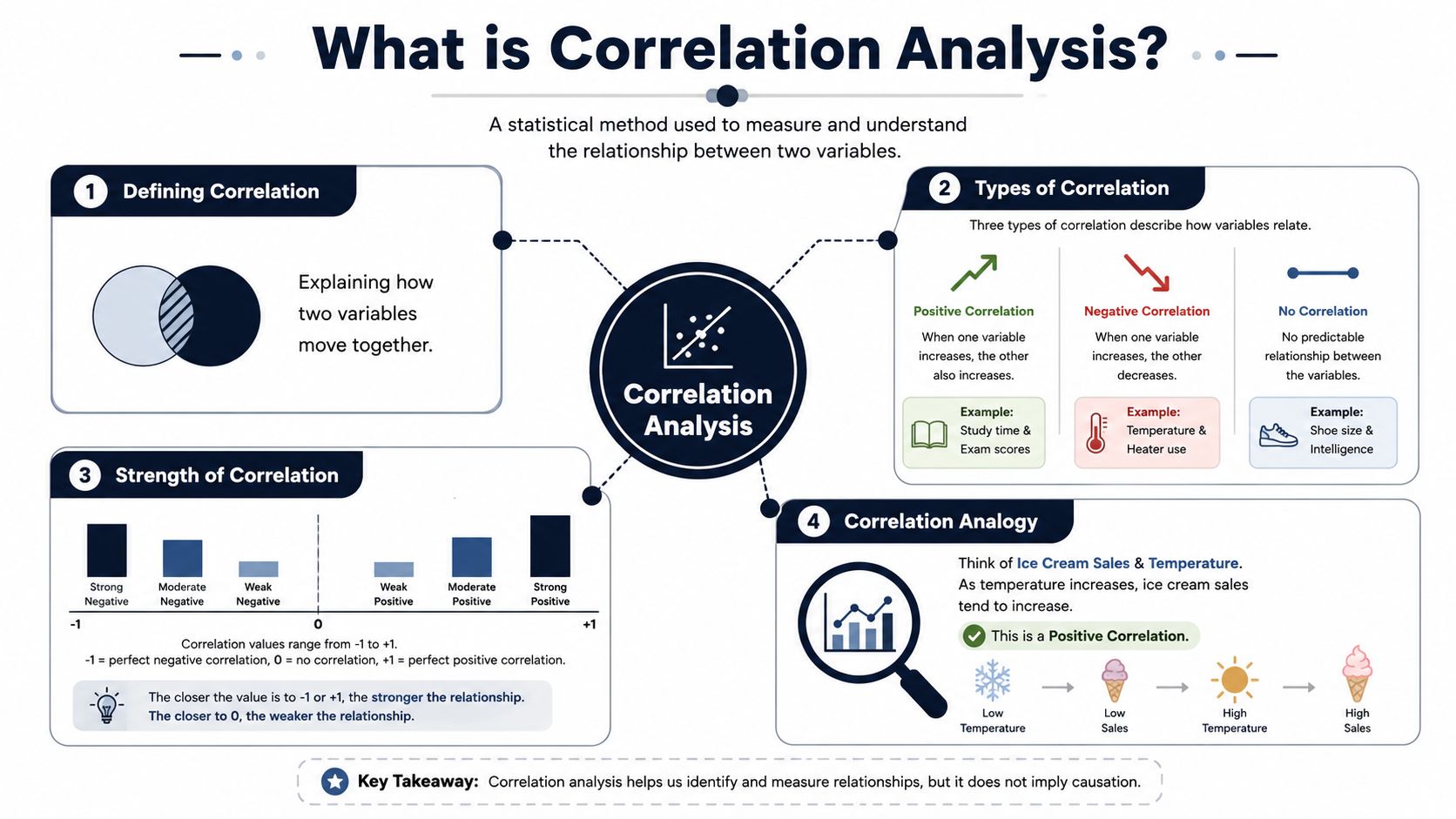
The simple mental model
Think of correlation like watching two dancers.
- Positive correlation: They step in the same direction together.
- Negative correlation: When one moves left, the other moves right.
- No correlation: They're on the same floor, but they're not dancing to the same rhythm.
That's the intuitive part. The formal part uses a correlation coefficient, often written as r, to summarize the relationship on a scale from +1 to -1. In that standard interpretation, +1 means a perfect direct linear relationship, -1 means a perfect inverse relationship, and 0 means no correlation (reference on Pearson correlation and its range).
Why this matters in product work
A product manager usually isn't asking, “What's the abstract association between variables?” The actual question is closer to this:
- Behavior and outcome: Do accounts that adopt a workflow renew more often?
- Friction and revenue: Do customers who hit repeated setup errors downgrade more often?
- Feedback and retention: Do low satisfaction rankings line up with lower expansion likelihood?
Core idea: Correlation helps you spot patterns worth investigating, not truths you should accept blindly.
Here's where new PMs often get confused. Correlation is about movement together, not about one thing automatically causing the other. If support ticket volume and churn rise together, the useful takeaway is not “support tickets cause churn.” The useful takeaway is “there may be a meaningful relationship here, so we should investigate.”
What the number doesn't tell you by itself
A single coefficient can hide a lot.
It won't tell you whether the relationship is sensible in business terms. It won't tell you whether a third factor is driving both variables. It also won't tell you whether the pattern is curved, messy, or dominated by a handful of unusual accounts.
That's why understanding correlation analysis in product settings always starts with intuition first. If you don't know what the relationship should mean in the world, the number alone won't save you.
Choosing the Right Correlation Measure
A common mistake is talking about “the correlation” as if there's only one method. There isn't. Different correlation measures fit different kinds of product data.
If you choose the wrong one, you can get a tidy-looking result that means very little.
The big three in practical terms
Pearson correlation is the default, often the first method introduced. It works best when you're comparing two continuous variables and you expect a linear relationship. Think of feature usage frequency and average contract value, where you want to know whether the points roughly follow a straight-line pattern.
Spearman rank correlation is often better when your data is ranked, uneven, or pushed around by outliers. If you're comparing customer satisfaction scores with renewal likelihood, Spearman is often a more natural fit because it focuses on ranked order rather than assuming a clean straight-line pattern.
Kendall's Tau is another rank-based measure. It's especially useful when data is smaller, tied ranks are common, or you want a reliable non-parametric option. In product work, that can happen when you're working with segmented account reviews, manually scored customer interviews, or a limited set of enterprise renewals.
According to Drive Research's overview of correlation methods, Spearman rank correlation and Kendall's Tau provide superior alternatives to Pearson r when you're analyzing ranked variables or data with outliers where linearity assumptions fail.
Correlation coefficients compared
| Coefficient | Measures | Data Type | Best For |
|---|---|---|---|
| Pearson | Linear relationship between two continuous variables | Continuous numeric data | Clean, roughly linear product metrics such as sessions and spend |
| Spearman | Relationship in ranked order | Ordinal, ranked, or non-normal data | Satisfaction rankings, severity rankings, noisy behavioral data |
| Kendall's Tau | Concordance between rankings | Ordinal or smaller datasets with ties | Smaller account sets, tied survey responses, robust ranking comparisons |
How to choose without overthinking it
Use this quick decision logic:
- Choose Pearson when both variables are numeric, continuous, and you expect a straight-line relationship.
- Choose Spearman when rank matters more than exact distance between values.
- Choose Kendall's Tau when your sample is smaller or rankings contain many ties.
Product examples that make the distinction clear
Suppose you want to study whether time spent in a setup flow relates to successful activation. If both values are continuous and the scatterplot looks roughly linear, Pearson is a reasonable place to start.
Now change the problem. You want to compare customer health ratings from success managers with renewal likelihood. Those ratings are closer to ordered categories than pure continuous measurements. Spearman is likely a better fit because the ranked relationship matters more than exact intervals.
A third example is support data. Let's say you manually classify a limited number of strategic accounts by severity of reporting pain and then compare those rankings with expansion readiness. That's a strong case for Kendall's Tau because the dataset may be small and the ranking ties may be frequent.
The right coefficient depends less on what tool you have open and more on how your data behaves.
The business impact of picking correctly
This sounds technical, but the consequence is practical. If you apply Pearson to messy ranked feedback, you may understate a pattern that matters. If you use a rank-based measure on the wrong problem, you may smooth away useful numeric detail.
For product teams, the choice shapes prioritization. The wrong method can make a bug theme look harmless or make a weak customer pattern appear stronger than it really is. The right method gives you a cleaner path from evidence to roadmap decisions.
How to Interpret Correlation Results Accurately
Once you have a correlation value, the next question is simple: Is this relationship strong enough to matter?
The answer starts with direction. Positive values mean the variables tend to rise together. Negative values mean one tends to rise while the other falls. The closer the coefficient gets to either end of the scale, the stronger the relationship.
Reading strength without overreacting
In practical business use, one common benchmark is that scores from +0.5 to +1 indicate a very strong positive correlation, while scores from -0.5 to -1 indicate a strong negative correlation (FlexMR explanation of correlation thresholds).
That doesn't mean every value above those thresholds deserves immediate action. It means you've found a relationship strong enough to justify attention, especially if it aligns with the story your team is seeing in the product.
A simple way to read the output:
- Near +1: strong direct relationship
- Near -1: strong inverse relationship
- Near 0: little linear relationship
- Closer to the middle: some association may exist, but it may be weaker or less useful for planning
Why significance still matters
A coefficient can look promising and still be misleading if it's driven by randomness. In product analysis, this happens when the sample is thin, the segment is too narrow, or a handful of accounts create a pattern that won't hold up next month.
That's why teams also check the p-value. In plain language, it helps you judge whether the observed relationship is likely to be real rather than random noise. If you want a practical refresher on that logic, this walkthrough on how to do hypothesis testing is a useful companion.
A strong-looking relationship that isn't statistically reliable is a bad basis for roadmap decisions.
Interpreting with business context
The same coefficient can mean different things depending on the decision.
If you're exploring a low-risk UX tweak, a moderate relationship might be enough to justify a small experiment. If you're reallocating engineering capacity or changing pricing, you'll want stronger evidence and cleaner validation.
A few habits help here:
- Check the scatterplot: A single value can hide a strange shape or a small cluster driving the pattern.
- Compare across segments: A relationship in SMB may not hold in enterprise.
- Ask whether the result is actionable: Some findings are interesting but not useful.
Correlation interpretation is less about memorizing labels and more about disciplined judgment. The number gives you a signal. Your job is to decide whether that signal is trustworthy, meaningful, and worth acting on.
The Pitfalls Every Product Team Must Avoid
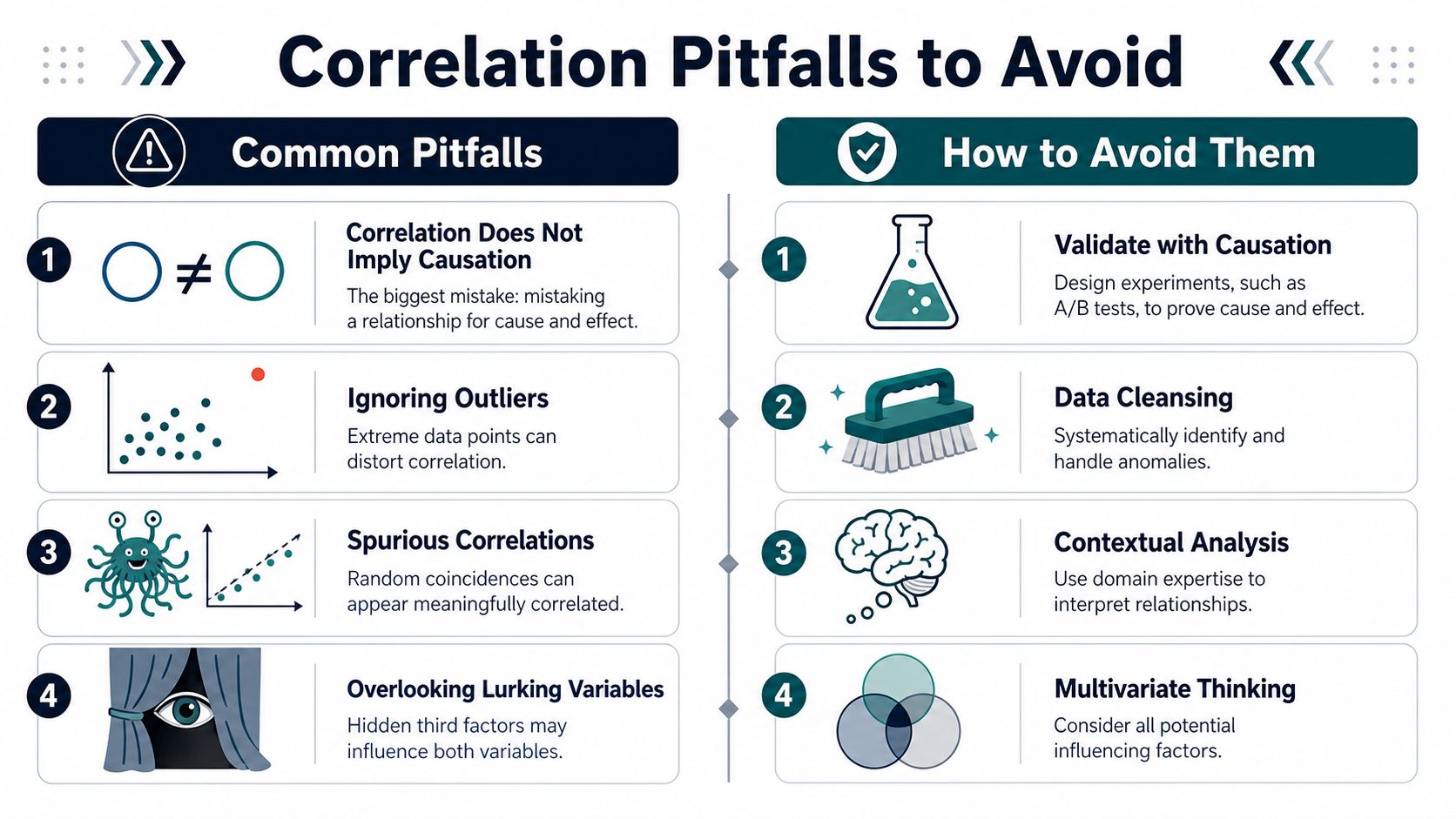
The biggest mistake in correlation work is also the most famous one. Correlation does not imply causation.
If ice cream sales and shark attacks both rise in the same season, it doesn't mean ice cream causes shark attacks. Summer drives both. In product terms, the equivalent mistake is seeing that accounts with more support interactions churn more often and concluding that support causes churn. More often, struggling accounts both contact support more and churn more. Support volume is a symptom, not the root cause.
A visual summary helps because these mistakes tend to repeat across teams.
The trap of messy product data
Product managers rarely work with neat academic datasets. They work with ticket tags that changed mid-quarter, free-text complaints, event streams with gaps, and one enterprise customer whose behavior dwarfs everyone else's.
That matters because messy data can distort correlation badly. One cited business-analytics discussion notes that 40% of correlation errors stem from unaddressed outliers and non-linearity (discussion of outliers and non-linearity in business analytics). Whether you use that figure as a warning sign or a checklist prompt, the lesson is the same. Outliers and curved relationships can fool you fast.
Four failure modes to watch
- Confusing relationship with cause: A feature request theme may correlate with churn because unhappy customers ask for more things, not because shipping that request would stop churn.
- Ignoring outliers: One very large account can make a weak pattern look strong.
- Missing non-linear patterns: Some product relationships curve. A moderate amount of usage may help retention, while extremely high usage signals strain or poor workflow fit.
- Forcing qualitative data into the wrong method: Support tickets and call notes need thoughtful coding or ranking before they can support reliable correlation work.
Here's a useful explainer if you want a quick reset on the concept before applying it in your own analyses:
How teams avoid bad conclusions
Most false confidence comes from moving too quickly from spreadsheet output to decision.
A safer approach looks like this:
- Inspect visually first. Look for curved patterns, clusters, and isolated extreme points.
- Interrogate the business story. Ask what third variable could explain both sides.
- Validate with experiments when possible. A/B tests, holdouts, and staged rollouts are for causation, not correlation.
- Treat qualitative signals carefully. Convert them into structured inputs before drawing conclusions.
When a correlation result matches a story your team already wants to believe, that's the moment to slow down.
Putting Correlation to Work in Your Product
Monday morning, the PM, support lead, and CS manager are all arguing for different priorities. Support wants a bug fix because ticket volume is rising. CS wants better onboarding because renewals feel shaky. Product wants to push a premium feature because expansion is slowing. Correlation analysis helps you turn that debate into a testable decision.
Used well, it connects messy product data, support themes, and account outcomes to questions that affect revenue. That is the core job here. You are not trying to produce a tidy statistic for a slide deck. You are trying to decide what to fix, what to ship, and what to measure next.
Start with a business decision, then frame the question
A useful correlation analysis begins with one choice your team may make.
For example, you might ask whether accounts that use a certain workflow every week renew more often. Or whether customers who raise the same reporting complaint tend to expand less. Or whether teams that invite multiple collaborators during onboarding reach activation faster.
Those questions work because they tie behavior to an outcome a PM can influence. Correlation is like checking whether two dials on your dashboard tend to move together. If one usage pattern keeps showing up beside churn risk or expansion potential, that pattern deserves attention.
Build the analysis in the order a PM would trust it
You do not need a large analytics stack for the first pass. Many teams start in Excel, Google Sheets, SQL, Python with pandas, or R. What matters is building the analysis in a sequence that matches how product decisions get made.
A practical workflow looks like this:
- Define the unit clearly: Account-level, user-level, or workspace-level analysis can lead to different conclusions.
- Pair one behavior with one outcome: For example, weekly use of a reporting feature and renewal status.
- Set the timing carefully: Usage should happen before the renewal, upgrade, or support escalation you want to study.
- Add product context: Segment by plan type, customer size, or lifecycle stage so one mixed dataset does not blur the pattern.
- Choose a method that fits the shape: Pearson works for straight-line relationships. Spearman or Kendall often fit ranked, noisy, or non-linear product data better.
- Check statistical support before acting: A coefficient can look promising and still be weak evidence. The UCLA Statistical Consulting guide to correlation and p-values is a practical refresher if you need to confirm how significance affects interpretation.
This matters even more with product data because the clean textbook case is rare. Usage can plateau. Ticket themes come in text, not neat numbers. Some relationships curve, especially around engagement. Moderate use may signal healthy adoption, while extreme use may reflect friction, workarounds, or operational stress.
Product use cases that are actually worth testing
Some of the best correlation work starts with questions hiding in plain sight.
Feature adoption and retention is one. If accounts that complete a collaborative setup flow stay longer, onboarding may deserve more investment than a new feature launch.
Support themes and churn risk is another. If customers mentioning export failures or reporting delays also show weaker retention, a low-volume bug can still be a high-value priority.
Qualitative feedback and expansion readiness is often missed in basic tutorials. Call notes, tickets, and survey responses can be coded into themes or ranked sentiment bands. Once structured, they can be tested against outcomes like expansion, contraction, or adoption of premium workflows. That helps bridge the gap between what customers say and what the business experiences.
Why visual workflows matter
A coefficient alone rarely changes a roadmap. A chart that shows the pattern, the segment, and the time window usually does.
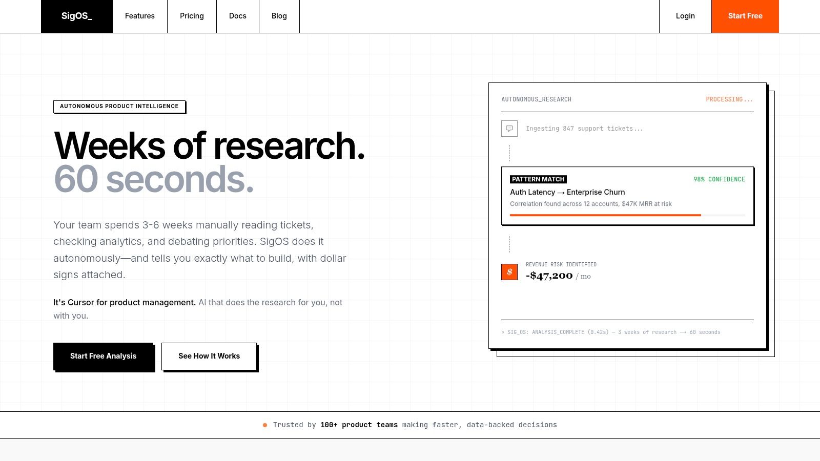
That is why repeatable reporting matters so much. Once teams start asking the same questions every week across support, product usage, and revenue data, manual work becomes the bottleneck. The challenge is not just running one analysis. It is keeping definitions consistent, refreshing the inputs, and making sure the result still reflects the current product.
Many PMs solve that by building a more systematic workflow for analytics for product managers. The benefit is not only speed. It is the ability to compare patterns over time, revisit assumptions, and keep testing whether the relationship still holds after releases, pricing changes, or onboarding updates.
Where teams usually get stuck in practice
The sticking points are familiar.
Data is split across Zendesk, Jira, CRM records, and product analytics. Support themes arrive as text and need coding before they can be compared with churn or expansion. And a correlation that looked useful last quarter may weaken after a pricing change or a major UX update.
Good product teams treat correlation as part of an operating rhythm. They use it to rank hypotheses, focus investigation, and point experiments toward the highest-value questions.
Correlation helps product teams prioritize with more evidence, especially when customer behavior, support friction, and revenue outcomes live in different systems.
A Checklist for Correlation-Driven Insights
Strong correlation work is rarely flashy. It's careful. It respects the data, checks assumptions, and stays humble about what the result can prove.
Use this as a working checklist before you present any finding to your team.
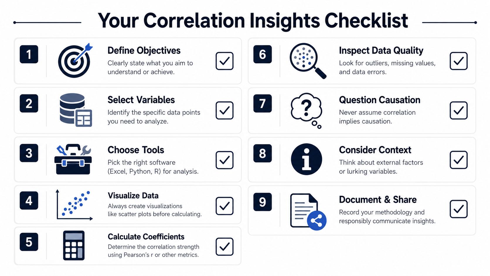
- Start with one decision: Tie the analysis to a real product choice, such as bug priority, onboarding improvement, or expansion target.
- Define variables clearly: Make sure each metric means one thing and is measured consistently.
- Look at the data before computing: Scatterplots often reveal problems the coefficient will hide.
- Match the method to the data: Pearson, Spearman, and Kendall's Tau are not interchangeable.
- Check for outliers and strange shapes: One unusual account can distort the pattern.
- Use significance as a guardrail: A promising coefficient still needs statistical support.
- Don't claim causation: Correlation identifies relationships, not proof of mechanism.
- Validate with follow-up work: Segment reviews, experiments, and customer interviews add confidence.
- Document the assumptions: If someone else can't reproduce the logic, the insight won't last.
Understanding correlation analysis gives product teams a sharper way to connect behavior, feedback, and business outcomes. The teams that get the most value from it don't treat it as a math exercise. They use it as a disciplined way to prioritize what customers need and what the business can't afford to ignore.
If your team wants a faster way to turn support tickets, behavior data, and customer feedback into prioritized product decisions, take a look at SigOS. It's built for finding the signal in messy product data so teams can act on correlations that matter instead of chasing noise.
Keep Reading
More insights from our blog



Ready to find your hidden revenue leaks?
Start analyzing your customer feedback and discover insights that drive revenue.
Start Free Trial →