Kano Model Analysis: A Practical Guide for SaaS Teams
Master Kano model analysis with this guide for SaaS teams. Learn survey design, feature categorization, and roadmap prioritization.

You've got three different teams asking for three different directions, the backlog is noisy, and every request sounds urgent until someone asks what it will change. Sales wants enterprise polish, support wants bug fixes, leadership wants differentiation, and your last survey produced opinions that didn't line up with usage. Kano model analysis gives you a cleaner way to sort the mess, but it only works when you treat it as a decision system, not a branding exercise.
The biggest mistake product teams make is assuming every request belongs in the same bucket. A feature can be expected, appreciated, ignored, or actively disliked, and the only way to tell the difference is to ask in a structured way, then check those answers against what people do. That's where the old survey method and modern product intelligence fit together well.
Why Product Teams Need a Better Way to Prioritize Features
Every SaaS team knows the cycle. Support forwards a thread full of requests, sales pushes a deal blocker, an executive asks why the roadmap doesn't include their favorite idea, and a researcher comes back with interviews that seem to contradict last quarter's feedback. The loudest item often wins, even when it doesn't deserve to.
That's how teams end up prioritizing by frequency, by seniority, or by the emotional weight of the last meeting. Those approaches can surface useful signals, but they don't tell you whether a feature is a baseline expectation, a competitive lever, or a nice surprise that won't move retention. Kano model analysis exists to separate those cases before the roadmap gets polluted.
Why frequency counts fall short
Counting requests tells you what people mention. It doesn't tell you how they feel when the feature exists or what happens when it's missing. A feature can show up in half a dozen tickets because it's a core expectation, while another feature may appear in only a few conversations but create real excitement when it ships.
That distinction matters because roadmaps are scarce-resource decisions. If you spend engineering time on features that sound popular but don't change satisfaction, you're just converting noise into work. If you skip the basics, you create churn risk and damage trust.
Practical rule: when every request looks equally important, the roadmap is already doing too much listening and not enough ranking.
Teams that use AI to speed up feedback triage can get faster first passes, especially when sorting large volumes of comments. A useful starting point is get faster results with AI, but the output still needs a prioritization model that distinguishes necessity from delight.
What the team is really trying to answer
The question is not “Do customers want this?” They usually do, at least in abstract terms. The better question is, “What kind of want is it, and how should that shape the roadmap?”
That shift changes meetings. It gives product, support, and revenue teams a shared language for discussing trade-offs without relying on gut feel. It also makes it easier to explain why some loud requests don't deserve immediate work, while some quiet ones absolutely do.
Understanding the Kano Categories and What They Reveal
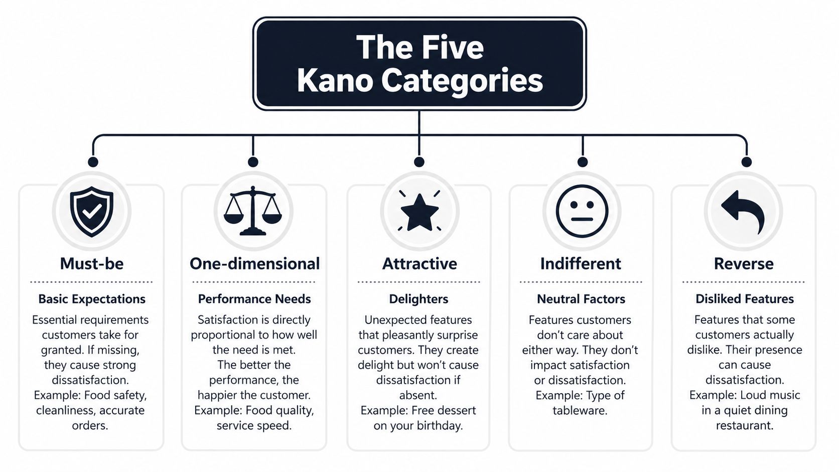
Kano analysis was introduced in the 1980s by Professor Noriaki Kano to explain why some product features create strong satisfaction while others are merely expected. The model groups attributes into five categories, Must-be, One-dimensional, Attractive, Indifferent, and Reverse. That structure still holds up because product markets keep getting more crowded, and customer expectations keep shifting.
A restaurant analogy that actually sticks
Think about a restaurant. Clean restrooms are a Must-be. Nobody praises the place for having them, but if they're dirty, the whole experience collapses. Food quality is One-dimensional, better ingredients, better execution, better satisfaction. A surprise dessert or a small free appetizer is Attractive, because it creates delight without being expected.
Then there are Indifferent items, like décor details most diners barely notice, and Reverse items, like a loud kitchen soundtrack that some guests actively hate. Product features behave the same way. A polished authentication flow may be table stakes, faster reporting may drive satisfaction linearly, and an unexpected automation may create delight.
What each category means for product strategy
Must-be features protect retention. If they fail, customers notice immediately, and they usually blame the product rather than the circumstance. They rarely create upside when they work well, but they prevent downside.
One-dimensional features are the competitive workhorses. The better you execute them, the more satisfaction you earn. These often show up in sales conversations because customers compare them directly across vendors.
Attractive features are your surprise advantage. They don't need to exist for the product to feel complete, but they can shape word-of-mouth and make a product feel smarter or easier than the competition.
Indifferent features look good on planning boards and disappear in real use. Reverse features are worse, because they can add friction for the users who matter most.
The useful habit is to stop treating “feature” as one thing. A feature is a hypothesis about satisfaction, and Kano model analysis gives you a way to test that hypothesis before you commit the build time.
Designing a Kano Survey That Actually Works
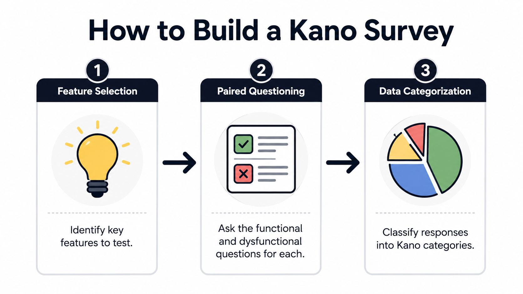
A Kano survey only works if the features are concrete enough to answer. Vague statements like “better AI” or “more automation” invite interpretive drift, which means you end up measuring wording instead of preference. The strongest surveys use specific product capabilities that people can picture in context.
Start with a narrow feature list
Microsoft's Kano Best Practices recommends limiting a study to about 20 features to reduce survey attrition, and it cites a recommended sample size of 50-300 respondents to support a 5-9% margin of error. That guidance is useful because fatigue ruins data quickly. If the survey feels endless, people stop reading carefully and the paired answers become mush.
A tight feature list also forces discipline. If a capability can't justify a spot in the survey, it probably doesn't deserve roadmap time yet. That's especially true for SaaS products where every team has more ideas than the release cycle can absorb.
Use paired functional and dysfunctional questions
The core mechanic is simple. For each feature, ask one functional question about what users think if the feature exists, and one dysfunctional question about what they think if it doesn't. Practitioner guidance describes this as the standard way to capture satisfaction in both directions, because a feature can feel fine when present and painful when absent.
Here's the survey structure in practical terms:
- Functional question. How would you feel if this feature were present?
- Dysfunctional question. How would you feel if this feature were absent?
- Answer scale. Keep the response options consistent across items so classification stays clean.
When the wording is neutral, people answer based on need rather than persuasion. When the wording sounds like a sales pitch, they answer the survey designer, not the product.
Practical rule: if a feature statement needs internal context to make sense, rewrite it before it goes to customers.
For teams that need a template for collecting customer feedback cleanly, collect feedback from customers is a good companion process to align with before survey launch. A Kano survey works best when it sits inside a broader feedback system, not as a one-off exercise.
Scoring Responses and Mapping Features to Categories
Once the responses come back, the job is to classify each paired answer against the Kano evaluation table. The important part is not just tallying totals, it's keeping the original response pairs intact long enough to avoid flattening meaningful differences between segments.
Map answers at the individual level first
Expert guidance recommends analyzing data at the individual-response level first, then aggregating by feature and customer segment so you don't mask segment-specific preferences. That matters because the same feature can land in different categories depending on who's answering. A power user and a new admin may be reacting to the same capability, but they're living in different product realities.
The evaluation step is mechanical. Each functional and dysfunctional response pair maps to a Kano category, and then you count how many respondents placed the feature in each bucket. The feature's dominant category is the one that appears most often, but the distribution tells you more than the label does.
Read the distribution, not just the winner
A feature with a dominant Must-be label and a heavy tail into One-dimensional is not the same as a feature with a clean consensus. Mixed results usually mean one of three things, the feature is useful to multiple segments for different reasons, the wording was too broad, or the product has matured unevenly across customer types.
Here's a simple working table you can use in analysis sessions.
| Functional Response | Dysfunctional Response | Kano Category |
|---|---|---|
| Like | Dislike | Attractive |
| Expect | Expect | Must-be |
| Neutral | Neutral | Indifferent |
| Like | Neutral | One-dimensional |
| Dislike | Like | Reverse |
A category label by itself can be misleading if the segment mix is wide. That's why aggregation should come after the individual classifications, not before. If you collapse the data too early, you'll lose the exact insight Kano is supposed to surface.
A good reporting habit is to show the dominant category, the segment split, and the rough degree of disagreement in the same view. That helps product, design, and go-to-market teams decide whether the feature is universal or only valuable to a subset of accounts.
For teams looking for a strong format to present those outputs, find actionable survey report examples can help shape the way results are communicated without turning the analysis into a slide deck full of filler.
Statistical Considerations Most Kano Guides Skip
Kano surveys can look authoritative while still being shaky. That usually happens when teams over-segment, collect too few responses in each slice, or treat a small survey as if it were a final verdict. The method is structured, but it doesn't magically remove sampling problems.
Don't create more segments than the data can support
The practical advice to keep a segment meaningful is simple. If you split by persona, plan, company size, and maturity all at once, you can end up with tiny cells that are hard to trust. Practitioner guides mention minimums like 30 responses per segment in some implementations, but the bigger point is that every extra segment increases the chance that a category result is unstable.
That's why segment design should follow the decision, not the other way around. Ask which split will change the roadmap. If the answer is only “it would be interesting,” leave it out.
Treat margin of error as a planning constraint
Microsoft's recommended 50-300 respondents for a 5-9% margin of error shows that Kano is meant to be a structured, statistically oriented prioritization tool, not a loose brainstorming worksheet. That doesn't mean every team needs the top end of the range, but it does mean you should be honest about how much confidence the survey can support.
A Kano study is a hypothesis generator, not a final referee.
That matters in product reviews because survey bias is real. People who respond are not always the average user, recall is imperfect, and stated preference often runs ahead of actual behavior. If a feature looks great in survey data but shows no sign of use once launched, the survey may have captured aspiration instead of demand.
Teams that want a cleaner way to validate assumptions before they escalate into roadmap commitments can pair survey research with how to do hypothesis testing as part of the decision flow. The point is not to turn every roadmap call into a lab experiment. The point is to avoid over-trusting weak signals.
Real SaaS Examples for Each Kano Category
A category label only becomes useful when it maps to something teams ship. In SaaS, the same feature can be essential in one market and irrelevant in another, so examples need to be grounded in customer context, not just abstract theory.
Must-be features protect trust
SSO for enterprise customers is a strong example of a Must-be feature. So are data encryption and basic reliability expectations. Nobody buys enterprise software because it mentions encryption in a demo, but they absolutely notice when security or access control is missing.
These features don't win deals by themselves, but their absence can kill them. The roadmap implication is blunt, if a must-be is weak, fix it before investing in anything flashy.
One-dimensional features win or lose comparisons
Dashboard load speed, report customization, and API rate limits are common One-dimensional features in SaaS. Teams compare them directly, and small improvements are felt in day-to-day work.
If a customer runs reporting every morning, faster output is not a theoretical improvement, it changes their routine. The same is true for power users hitting API limits or operations teams depending on configurable views. These are the features worth tuning when you want to compete on efficiency, scale, or professional polish.
Attractive features create memorable moments
AI-powered suggestions, proactive anomaly alerts, and well-designed onboarding motion can land as Attractive features when they reduce work before the user asks. The value is not just novelty, it's the feeling that the product anticipated a need.
Teams often overbuild here. A delighter that doesn't reinforce a real workflow becomes decoration. A delighter that shortens setup, speeds a sale, or reveals a risk earlier can influence adoption and expansion much more meaningfully.
Indifferent and reverse features drain focus
An elaborate permission hierarchy can be indifferent for SMB users if they rarely touch it. The feature may have looked important in planning because it sounded complex, but actual users may never notice it.
Reverse features are trickier. They often show up as complexity added for the sake of completeness. Power users may appreciate the option, while the majority feel slowed down or confused. In that case, the feature is not a win, it's a tax on clarity.
Connecting Kano Insights to Behavioral Product Intelligence
Survey answers tell you what people say. Behavioral data tells you what they do. The strongest product teams use both, because the gap between stated preference and revealed behavior is where a lot of roadmap mistakes hide.
Validate categories against real usage
A feature that ranks as Attractive in a survey but barely gets used after launch may have been appealing in the abstract and irrelevant in practice. A feature that surveys as Must-be but never appears in support complaints or usage drop-offs may be overestimated by respondents who know the “right” answer but don't feel the pain.
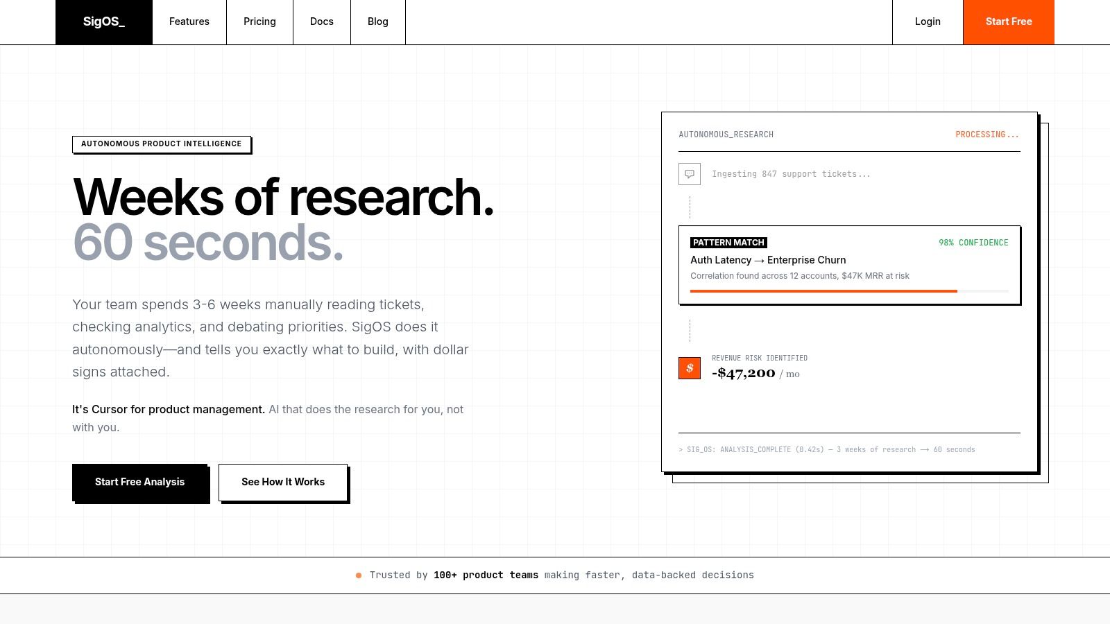
That is why continuous behavioral analysis matters. SigOS uses continuous behavioral analysis to ingest support tickets, chat transcripts, sales calls, and usage metrics, revealing patterns that correlate with churn, expansion, and revenue impact. That kind of signal turns Kano from a static questionnaire into a living prioritization input.
Use behavior to test the survey story
Behavioral product intelligence helps answer questions the survey can't. Are users touching the feature after onboarding? Do complaints cluster around missing capabilities or around workflow friction? Do certain feature requests show up alongside churn risk or expansion opportunities?
Those signals help you interpret mixed Kano results with more confidence. If a feature looks like a delighter on paper but nobody uses it, the product may be solving for curiosity instead of value. If a must-be feature keeps surfacing in exit calls and support threads, the survey may have understated how critical it really is.
For smaller teams that need a practical way to compare customer intelligence options, small team churn analytics tools can be a helpful benchmark when deciding how much behavioral depth to add to the process.
Turning Kano Results Into a Roadmap Decision Framework
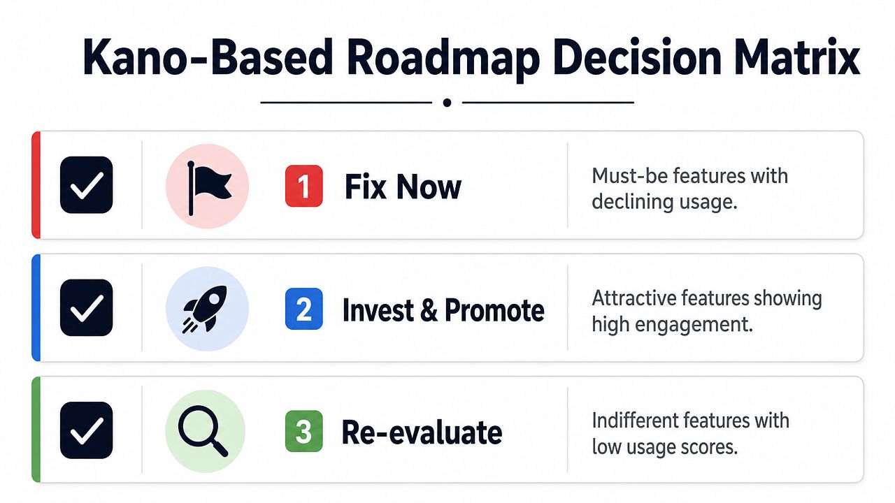
A Kano result should not end as a slide with five colored buckets. It should change what gets fixed, what gets promoted, and what gets cut. The cleanest roadmap decisions come from combining the category label with real usage and revenue signals.
A simple prioritization lens
Fix Now applies to Must-be features with declining usage or repeated complaints. These are the items that protect retention, trust, and account stability. If they're weak, they belong near the top of the backlog.
Invest and Promote applies to Attractive features showing strong engagement or clear expansion relevance. These are often the easiest features to tell a story around because they support differentiation and customer success at the same time.
Re-evaluate applies to Indifferent features with low usage and weak strategic value. These are the items that tend to survive by inertia. If nobody uses them and nobody relies on them, they should not crowd the roadmap.
A practical workflow teams can run
- Define the segment boundaries that matter to the product decision.
- Select the feature set tightly enough to keep attention high.
- Deploy paired Kano questions with neutral wording.
- Classify at the individual-response level before grouping anything.
- Aggregate by feature and segment to spot mixed patterns.
- Validate against behavioral signals so the survey story meets reality.
- Prioritize by category plus impact, not by category alone.
If you want a framework for turning those results into a planning conversation, feature prioritization matrix is a useful companion to the roadmap discussion.
The best Kano work I've seen doesn't try to make the survey the final truth. It treats the survey as a disciplined way to ask better questions, then uses behavioral evidence to prevent bad bets. That's the difference between a feature list that sounds compelling and a roadmap that earns its keep.
If you're ready to make Kano model analysis part of a stronger prioritization process, use the next planning cycle to combine survey categories with usage, churn, and revenue signals. SigOS can help teams do that validation work continuously, so the roadmap reflects what customers say, what they do, and what moves the business.
Keep Reading
More insights from our blog
Ready to find your hidden revenue leaks?
Start analyzing your customer feedback and discover insights that drive revenue.
Start Free Trial →