Real Time Analytics Dashboard
Real time analytics dashboard - Explore the architecture, key KPIs, and UX best practices for building a real-time analytics dashboard that drives fast
Most advice about a real time analytics dashboard gets the order backward. Teams start with charts, speed, and streaming tech, then wonder why nobody acts on the numbers. A dashboard that only shows fresh data is just a faster way to create confusion.
The actual job is to compress the time between an event and a decision. Microsoft's Dynamics 365 docs treat real-time dashboards as a live operational layer for volume, service levels, and capacity, while Google Analytics' Realtime report exposes active users over the last 5 and 30 minutes so teams can react while behavior is still unfolding, not after the moment has passed Microsoft Dynamics 365 real-time analytics dashboard documentation. That shift matters because the fastest dashboard in the room still fails if it doesn't tell someone what to do next.
Practical rule: if a metric doesn't have an owner, a threshold, and a response path, it doesn't belong in the live layer.
The industry distinction between true real-time, near-real-time, and historical also gets blurred too often. Engineering guidance separates sub-second delivery from systems that refresh in seconds to minutes, and that difference changes the entire architecture, cost profile, and expectation setting real-time dashboard implementation guidance. A sub-second alerting loop for revenue anomalies is a different product from a minutes-based operational view, and both are different from batch reporting. Confusing them creates either overbuilt infrastructure or dangerous blind spots.
If your team needs help improving response times across monitoring and incident workflows, CloudCops GmbH has a useful note on lower MTTD and MTTR. The point isn't that every dashboard should be an incident console. The point is that live visibility only pays off when it shortens the path to a concrete decision.
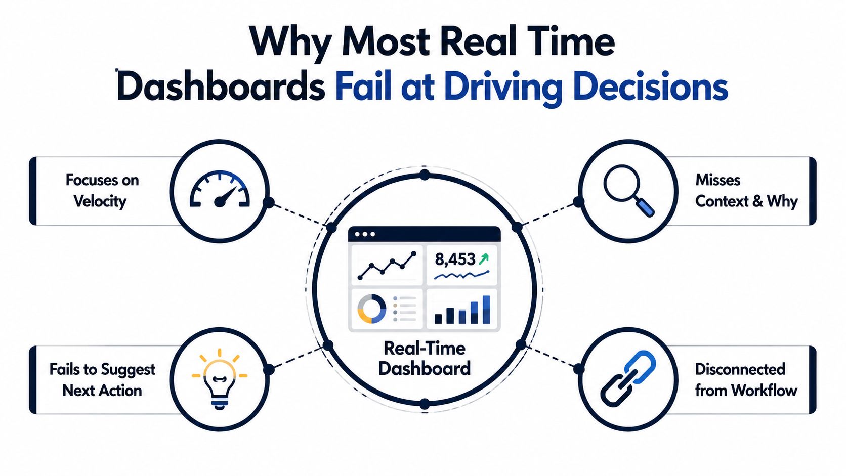
Why Most Real Time Dashboards Fail at Driving Decisions
A lot of dashboards fail for the same reason noisy group chats fail. Too many signals, not enough ownership, and no clear next step. The screen stays open, but the team stops trusting it.
The hidden problem is information overload. A live dashboard that exposes every metric at once asks people to interpret movement before they know what matters. The better pattern starts with a narrow decision, a defined response, and a way to route the right alert to the right person. Once the live layer turns into a wall of motion, people learn to ignore it.
Decision compression beats raw visibility
A useful mental model is simple. A real time analytics dashboard is not a reporting page, it is a decision-compression system. It should shrink the gap between a signal appearing and a human or workflow responding.
That is why the best dashboards start from one question, not ten. Is support volume spiking right now. Is a launch driving adoption. Is churn risk rising in the accounts that matter most. Each of those decisions has a different freshness requirement, so each deserves a different view.
Fresh data without a response path just produces anxiety at scale.
The difference between the layers matters here. Historical dashboards serve analysis over hours or days. Near-real-time systems refresh in seconds to minutes. True real-time aims for sub-second delivery, which only makes sense when the action window is just as tight. A lot of teams build the third layer when they only need the second.
That is how the live dashboard turns into expensive noise. Instead of compressing decisions, it multiplies them. Instead of helping a product manager prioritize the next escalation, it pushes every event onto the same screen with equal visual weight.
Ownership changes what belongs on the screen
A dashboard is useful when someone can answer, “What happens if this moves?” If nobody owns the metric, the response expectation is unclear, and the live signal is basically decorative. Microsoft's real-time analytics model makes that operational framing explicit through KPI reporting for volume, service levels, and capacity that updates live rather than in batches.
The best teams define the response before they define the chart. If a threshold is crossed, who gets notified. What gets created. Which issue gets escalated first. That is the difference between a monitoring surface and a decision surface.
Live dashboards also need a cutoff for what gets promoted into the real-time layer. A metric that only supports periodic review belongs in a normal report, not beside the signals that can change revenue or customer outcomes right now. Product teams that want cleaner signal-to-action loops usually pair this discipline with self-serve analytics workflows that let operators reach the underlying context fast. Without that, the dashboard becomes a display case for activity instead of a tool for decisions.
If your team needs help improving response times across monitoring and incident workflows, CloudCops GmbH has a useful note on lower MTTD and MTTR. The point is still the same. Live visibility only pays off when it shortens the path to a concrete decision.
Business Value and Use Cases for SaaS Product Teams
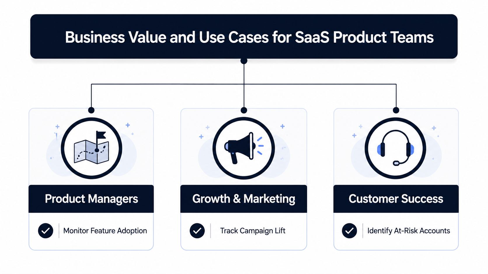
SaaS teams don't buy live dashboards because they love motion. They buy them because certain decisions decay fast. Product managers need to see adoption changes while launch context is still fresh. Customer success teams need to catch risk before the account drifts. Growth teams need to know whether a campaign is working while budget is still being spent. Support leaders need to see service-level pressure before queues become a fire drill.
Match the freshness tier to the decision
Not every decision deserves the same clock speed. A feature adoption review may work well with near-real-time updates, while a churn-risk alert for a strategic account needs a much tighter loop. In practice, the question is whether the decision loses value if it waits for the daily report.
Product teams usually care about feature adoption velocity, funnel movement, and churn-risk indicators. Growth teams care about campaign lift and drop-off patterns. Support and customer success care about open cases, escalation triggers, and service-level changes. The value comes from pairing each live signal with a specific action, not from watching the number twitch.
Action test: if the metric changed, would the right person do anything different before the next batch report arrives?
That test helps teams avoid wasting engineering effort on unnecessary sub-second systems. Some problems only need hourly or daily freshness. Others need live routing, especially when a spike creates revenue risk or an opportunity is short-lived. The engineering burden should match the business cost of waiting.
Build for revenue-weighted decisions
A strong dashboard doesn't just show status, it prioritizes decisions by impact. A support volume spike from a low-risk account is not the same as a spike from a customer tied to expansion revenue. A product issue from a free plan user is not the same as the same issue inside an enterprise workflow. The dashboard should help the team treat those signals differently.
That's where a platform like SigOS's self-serve analytics approach fits naturally, because product teams often need to turn qualitative signals into something that can be triaged. The key is not self-serve for its own sake. It's making sure the live view points to the right decision, in the right order, with the right owner.
A practical way to classify your own use cases is to ask three questions. Does the signal change frequently enough to matter live. Does the action window expire before a batch job would land. Does the decision affect revenue, retention, or customer experience enough to justify immediate routing. If the answer is yes to all three, the live layer is probably justified.
Essential KPIs and Visualization Patterns
The easiest mistake is to stuff every interesting number into one canvas. The better move is to group KPIs by decision type, then choose visuals that help people act fast. A dashboard for revenue recovery should not look like a dashboard for queue health.
| Decision Category | Example KPIs | Best Visualization | Freshness Tier |
|---|---|---|---|
| Revenue impact | Revenue per hour, expansion signals, churn-risk scores | Threshold gauges, sparklines | Near-real-time to true real-time |
| Operational health | Error rates, latency percentiles, queue depths | Line charts, heatmaps | True real-time for incidents |
| User behavior | Active sessions, feature adoption velocity, funnel drop-off | Funnel charts, trend lines | Near-real-time |
| Support load | Ticket volume, resolution time, escalation rate | Stacked bars, alert cards | Near-real-time |
The point of this table isn't completeness. It's discipline. Each category asks a different operational question, so each one deserves a different visualization pattern and a different freshness target. If you use a heatmap for a churn alert, people may notice the pattern but miss the action. If you use a gauge for funnel analysis, you'll flatten the nuance.
For a practical overview of trustworthy dashboard presentation, the design advice at HelpWithMetrics on dashboard design best practices is useful because it keeps the focus on clarity instead of decoration. That matters in live systems, where a pretty chart that hides timing or ownership is a liability.
Show context, not just change
Every KPI should show the time of the latest update and a path to the underlying record. Without that, a user can't verify whether the value is fresh, provisional, or already stale. This is one of the reasons real-time dashboards in major products feel reliable, they don't just expose numbers, they expose context.
The visualization choice should support the decision, not compete with it. Sparklines work well for trend detection because they keep attention on direction. Threshold gauges work when someone needs to know whether a value crossed a line. Heatmaps help with pattern recognition across segments. Waterfall charts are useful when the team needs to understand where a funnel leaked.
The internal SigOS overview of data analytics dashboards aligns with this approach because product teams usually need a layered view, not a single monolithic chart. Live numbers matter, but only when they're tied to an owner and a response protocol. Otherwise, they're just visually expensive noise.
Recommended Architecture and Data Pipeline Patterns
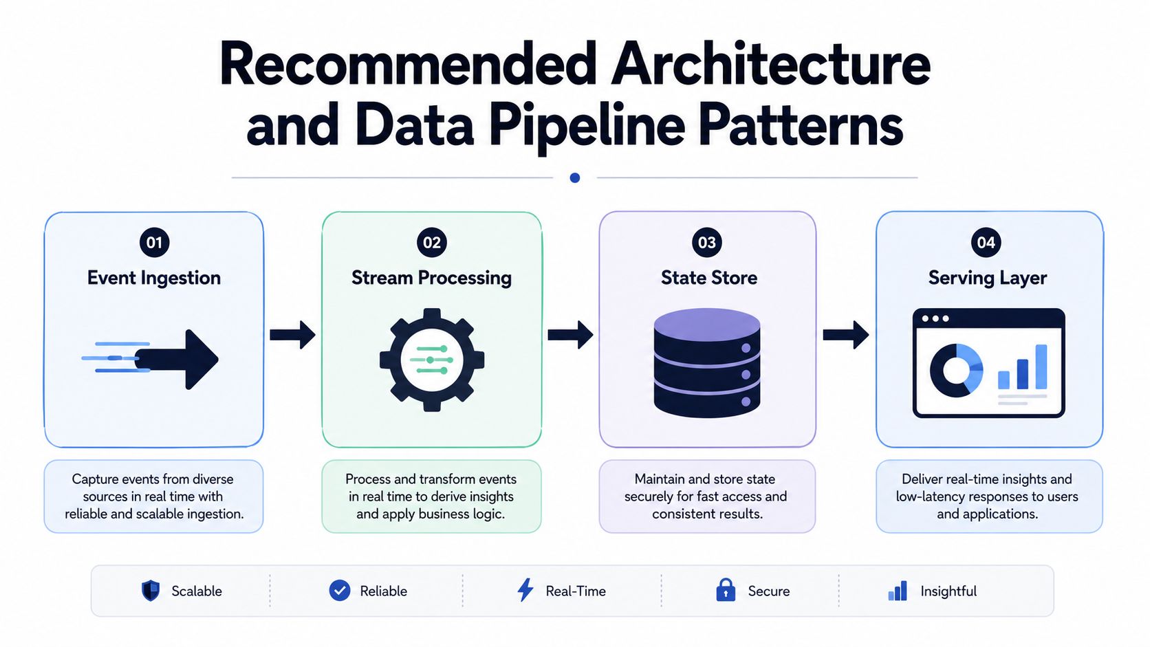
A production real time analytics dashboard lives or dies in the pipeline, not in the browser. The UI is only the last step. The hard work is turning raw events into low-latency metrics that product, revenue, and operations teams can trust enough to act on.
Build the pipeline in layers
The practical pattern is usually simple. Events enter through a broker like Kafka or Kinesis. A stream processor or materialized view pre-aggregates them. A low-latency OLAP store like ClickHouse or Druid serves the data. The browser receives incremental updates over WebSockets or Server-Sent Events real-time dashboard architecture.
That separation matters because dashboards ask the same questions repeatedly. If you skip pre-aggregation, the system keeps recomputing the same KPIs from raw rows, which raises query latency and cost. The pipeline should turn raw events into time-windowed rollups as early as possible, then preserve a clear path back to the underlying record for audit and debugging.
Treat the hot path and cold correction path differently
Streaming systems rarely behave like a single perfect stream. The fast path publishes provisional metrics quickly. A reconciliation layer later handles late-arriving data, retractions, and joins that would otherwise distort the final view. That split keeps the dashboard useful without pretending the first number is the final answer.
Engineering reality: a live number only earns trust when the system can distinguish provisional from final.
Watermarking and periodic backfills earn their place here. They add operational complexity, but they also protect trust in KPIs like churn-risk alerts and revenue summaries because users can see that the dashboard knows the difference between “updated now” and “settled later.” For teams that need a concrete reference point, the data architecture diagram guide shows how to separate ingestion, processing, storage, and serving so ownership stays visible across the stack.
A related pattern shows up in fraud systems. The FalkorDB graph database fraud guide is useful because fraud detection faces the same structural tension, fast signal, delayed reconciliation, and a low tolerance for bad reads. The lesson carries over to dashboards that are supposed to trigger real action before the data is perfectly finalized.
Don't confuse freshness with frontend tech
A lot of teams spend time on React polling intervals or chart animation while the pipeline remains slow. That gets the priority wrong. End-to-end freshness depends much more on how quickly the pipeline can process, aggregate, and deliver events than on the chart library itself.
The same architectural discipline applies to revenue-sensitive dashboards. SigOS ties the live pipeline to decision surfaces instead of leaving metrics stranded in a pretty interface. For a broader view of how product telemetry gets arranged for action, the internal data analytics dashboards overview is relevant because product teams usually need layered signals, not a single monolithic chart. Live numbers only matter when they connect to ownership, response rules, and a decision that changes what the team does next.
Implementation Best Practices for UX and Alerting
The most common failure mode isn't the wrong metric. It's the right metric presented in a way that people immediately mute. If the dashboard creates a constant sense of urgency, the team will treat it like background noise.
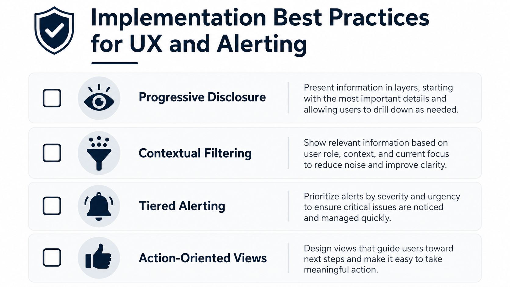
Use progressive disclosure
Start with summary metrics and let people drill into detail only when they need it. That keeps the live surface readable. It also keeps the most important signal from getting buried under supporting detail.
A strong live dashboard should answer three questions in order. What changed. How bad is it. Where do I go next. If the interface forces users to hunt for that sequence, the design is already working against them.
Route alerts with ownership and context
Alerts should not fire into a void. They need a clear owner, a revenue or service context, and an action path. A revenue-impact alert should go to the team that can triage it, not to a shared inbox that nobody monitors.
The alert threshold itself matters too. Industry guidance recommends meaningful thresholds, not constant pings, and warns that alerts every few minutes train teams to ignore them real-time dashboard implementation guidance. That's a design problem, not just a tuning problem. If your alerting model lacks triage logic, users will treat every notification as equally unimportant.
A dashboard should also make the timing explicit. Current status, latest update time, and a path to the underlying record reduce guesswork. Recent coverage of live dashboard practice emphasizes those elements because teams need to act without losing context, especially when the value is changing quickly.
Keep security and privacy in the implementation checklist
Live dashboards often sit on top of sensitive customer behavior data, so access control matters as much as latency. Encrypt the data in transit and at rest. Limit who can see raw records. Make sure models processing customer data are not retrained on that same data unless that is explicitly intended and governed.
That last point is easy to ignore during launch pressure. Don't. A dashboard that surfaces sensitive signals but ignores governance will eventually create a much bigger operational problem than stale reporting ever did.
How SigOS Powers Revenue Weighted Product Dashboards
SigOS fits into this stack as a signal layer, not as a charting layer. It ingests support tickets, chat transcripts, sales calls, and usage metrics, then surfaces patterns that correlate with churn, expansion, and revenue impact. In practice, that means product and growth teams get a dashboard each morning highlighting the issues most likely to cost real money and the feature requests most likely to lead to bigger deals.
The operational value is in the routing. SigOS's integrations with Zendesk, Intercom, Linear, Jira, and GitHub let teams turn an emergent pattern into an issue with a revenue impact score, instead of leaving the insight trapped in a report. That's the difference between “we noticed something” and “we assigned it to someone who can fix it.”
A live dashboard becomes more useful when it can blend structured usage signals with unstructured feedback. That's where continuous behavioral analysis matters. It can surface a pattern in support conversations before the same issue becomes a churn event, or show that repeated feature requests are lining up with a high-value opportunity. In the language of dashboard design, SigOS provides the decision signal that sits upstream of the visualization.
The product also emphasizes security-first encryption and states that models are never retrained on customer data, which matters when the dashboard is being fed by support and customer communications. For teams evaluating product intelligence as a source of live signals, that governance layer is part of the architecture, not an afterthought.
Building Your Real Time Analytics Roadmap
Start with the decision, not the data. If the team can't name the action that follows a signal, the dashboard should stay in batch reporting. If the decision has a short window, a live or near-live layer makes sense. If it doesn't, save the complexity.
The practical roadmap is usually phased. Begin with near-real-time for high-value decisions that need timely visibility but not sub-second delivery. Move to true real-time only when the business cost of waiting is clear and the ownership model is already in place. Build the response protocol before the alert volume grows.
If your team is deciding whether to build, buy, or augment, use three filters. Decision ownership, data governance, and actionability. If those are weak, a custom streaming stack will only give you a faster mess. If those are strong, the dashboard can compress the loop from signal to action.
If you want a real time analytics dashboard that connects live product signals to the decisions your team already makes, SigOS is built for that workflow. It turns support, sales, and usage data into revenue-weighted signals, then routes them into the tools your team already uses. Visit the product, see how it fits into your dashboard stack, and decide whether your next live view should be a chart or an operating system for action.
Keep Reading
More insights from our blog
Ready to find your hidden revenue leaks?
Start analyzing your customer feedback and discover insights that drive revenue.
Start Free Trial →