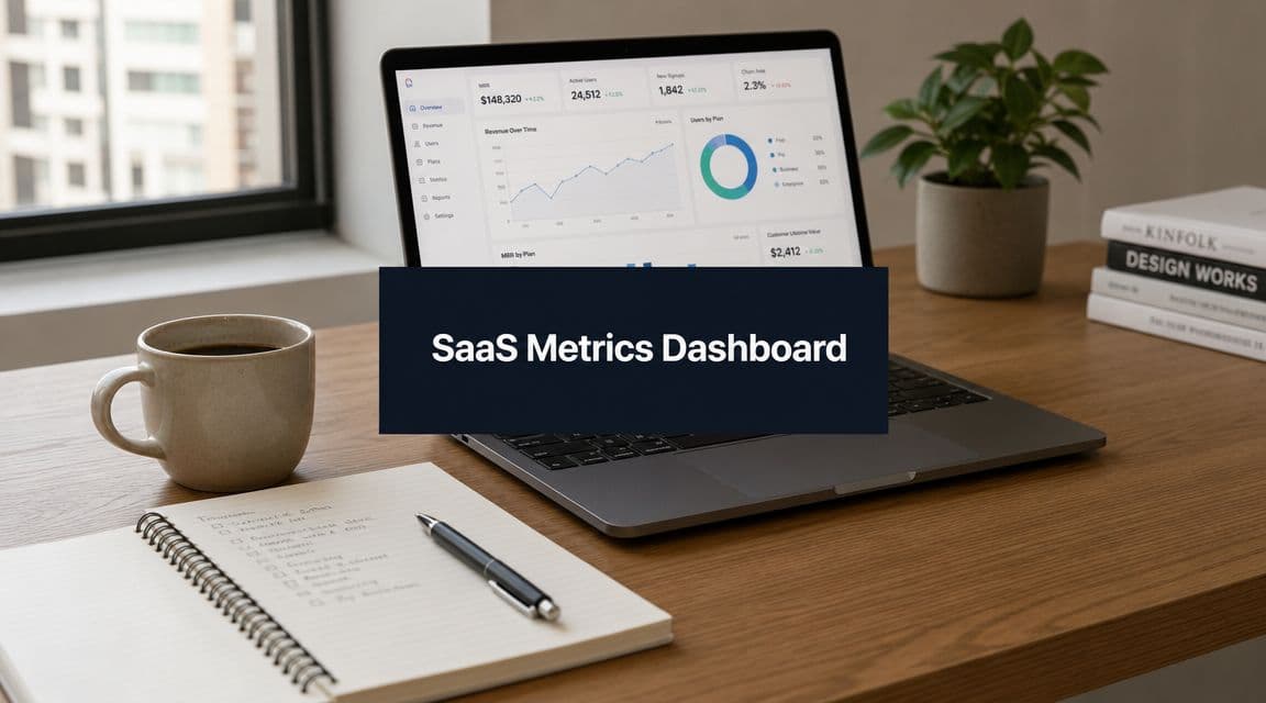
Your SaaS Metrics Dashboard: A Guide to Actionable KPIs
Build a SaaS metrics dashboard that drives growth. This guide covers key KPIs (MRR, Churn, LTV, CAC), dashboard design, and how to turn insights into action.
You're probably looking at three dashboards right now.
One lives in your billing tool and tells you revenue moved. Another sits in Mixpanel or Amplitude and shows that feature usage dipped. A third lives in Zendesk, Intercom, or Slack and makes it painfully obvious that support volume is climbing. Each one is technically useful. Together, they still don't answer the question your team needs answered: what's happening in the business, why is it happening, and what should we do next?
That's why most SaaS metrics dashboards fail. They report the past cleanly, but they don't diagnose the present. A useful dashboard shouldn't behave like a scoreboard. It should behave like an instrument panel in a cockpit, showing current conditions, identifying risk early, and helping the team make course corrections while there's still time.
Beyond Reports The Modern SaaS Metrics Dashboard
A modern SaaS metrics dashboard isn't a prettier weekly report. It's a decision system.
Initial efforts often focus on the well-known metrics. MRR, ARR, churn, retention, CAC, CLTV. Those matter. But most dashboard advice stops there. It tells you what to display, not how to connect the signals that explain root cause. That gap matters because churn rarely appears out of nowhere. It usually follows weak onboarding, low activation, unclear value, poor support, or poor feature adoption, which is exactly the underserved angle highlighted in UXCam's discussion of SaaS metrics dashboards.
Why static dashboards break down
A static dashboard tells you that churn increased. A diagnostic dashboard tells you:
- Which segment moved: New accounts, mature accounts, self-serve customers, or enterprise tenants.
- What changed first: Activation completion, weekly engagement, support backlog, failed onboarding steps, or usage of a core feature.
- What the likely cause is: Product friction, pricing mismatch, onboarding confusion, or unresolved service issues.
That's the difference between reporting and operating.
I've seen teams waste entire quarters debating a churn problem because each function had only its own slice of the story. Product looked at drop-off charts. Customer success looked at escalations. Finance looked at revenue erosion. Sales blamed ICP quality. Everyone had a valid point, and nobody had the full picture.
A dashboard that can't connect behavior to revenue is just a filing cabinet with charts.
What a useful dashboard actually does
The job of the dashboard is to connect systems that were never designed to tell one story on their own. Product analytics explains what users do. Billing explains what they pay. CRM explains what they bought and when. Support explains where they struggle.
A good operating model also separates executive financial visibility from product diagnosis. If you need a complementary view at the leadership layer, these financial dashboards for CEOs are a useful contrast to a product-driven diagnostic setup.
For product and growth teams, the more important move is building a dashboard that answers cause-and-effect questions. That usually means combining:
- Behavioral signals such as activation milestones, feature adoption, and frequency of use
- Support signals such as ticket themes, escalations, and unresolved friction
- Commercial signals such as plan type, renewals, contraction, and churn
If you're still organizing reporting around departments instead of customer outcomes, start with a tighter metrics framework like the one outlined in metrics and reporting.
The Lagging Indicators Every SaaS Must Track
You still need the financial basics. They are lagging indicators, but they are foundational. They tell you what the business has already earned, lost, retained, or spent. Without them, the rest of the dashboard turns into product theater.
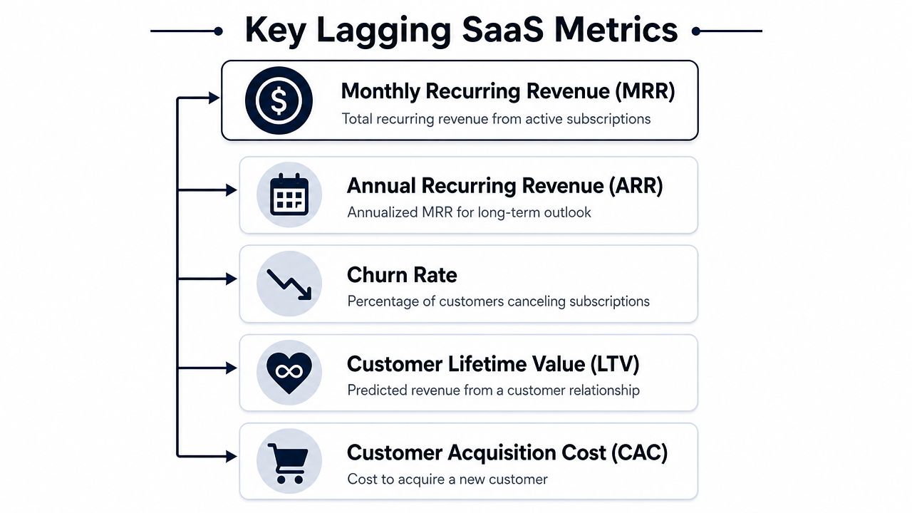
The five numbers that anchor the business
Think of these as the accounting side of your operating panel.
| Metric | What it tells you | Simple way to think about it |
|---|---|---|
| MRR | Current recurring revenue base | Your monthly run-rate heartbeat |
| ARR | Annualized recurring revenue | Your long-view revenue baseline |
| Churn | What you're losing | The leak in the bucket |
| LTV or CLTV | Expected customer value over time | How much a customer relationship is worth |
| CAC | Cost to acquire a customer | What you paid to fill the bucket |
How to use them without fooling yourself
MRR is the cleanest pulse check for a subscription business. It's your current recurring revenue from active subscriptions. If MRR stalls, you don't automatically have a growth problem. You might have a conversion problem, a retention problem, or an expansion problem. MRR is the score. It is not the explanation.
ARR is the annualized view of that recurring base. It matters most when leadership wants to understand longer-horizon planning, board reporting, and how durable the revenue base looks over time.
Churn needs more nuance than it is often given. Industry guidance for SaaS dashboards recommends tracking a segmented metric stack that includes MRR or ARR, churn, retention, CAC, and CLTV, and it specifically recommends separating logo churn from revenue churn so you can see whether losses come from many smaller accounts or fewer high-value customers, as noted in Amplitude's SaaS metrics dashboard template.
Practical rule: If you only track one churn number, you're hiding the shape of the problem.
LTV tells you what a customer relationship is worth over its lifespan. It's not a bragging metric. It's a budgeting constraint. If your average customer doesn't stay long or doesn't expand, your LTV compresses fast.
CAC tells you what it costs to acquire that customer through marketing and sales effort. On its own, CAC can be misleading. A high CAC might be fine if the customers retained are valuable and durable. A low CAC can still be bad if those users churn before they realize value.
The metrics that matter together
The core point is interaction, not isolation.
- MRR plus churn tells you whether growth is being offset by loss.
- CAC plus LTV tells you whether growth is economically sensible.
- Revenue churn versus logo churn tells you whether you have a broad retention issue or a concentrated account risk issue.
If your dashboard only shows these metrics as separate tiles, it's incomplete. Finance can read the symptoms, but operators still can't see the disease.
Your Dashboard's Secret Weapon Leading Indicators
Financial metrics are the rearview mirror. Useful, necessary, and too late if you need to change direction this week.
The best SaaS metrics dashboard gives leading indicators equal or greater weight. That means activation, engagement, and feature adoption sit upstream of churn and MRR. They don't replace financial metrics. They explain them before finance feels the impact.
Activation is the first proof of value
Every product has an activation moment. It's the point where a user stops evaluating and starts getting value.
For Slack, that might be a team conversation that replaces email. For a BI tool, it might be the first dashboard built from live data. For a support tool, it might be the first workflow that closes tickets faster. The exact definition is product-specific, but the principle is universal. A user who hasn't reached value is a future churn candidate wearing a temporary trial badge.
Teams often define activation too loosely. They count logins, page views, or setup steps. Those are motion, not value. Activation should represent a meaningful action tied to the product's core promise.
Engagement has to mean more than activity
A lot of dashboards confuse presence with usage.
A customer can log in often and still be at risk. I've seen this with tools that become mandatory but not valuable. Users return because they have to, not because the product helps them succeed. That account looks active on paper right up until renewal gets tense.
Track engagement around core behaviors, not generic traffic:
- Depth of use: Are users reaching the key workflow or just bouncing around setup screens?
- Breadth of adoption: Is one champion using the product, or has usage spread across the account?
- Consistency: Does usage persist over time, or does it spike once and disappear?
Low engagement is often the smoke. Churn is the fire your finance dashboard notices later.
The leading-to-lagging chain
A diagnostic dashboard should make these relationships visible:
| Leading signal | Common interpretation | Lagging outcome it may influence |
|---|---|---|
| Activation stalls | Onboarding friction or weak initial value | Lower conversion, weaker retention |
| Core feature adoption drops | Product friction or shifting relevance | Rising churn risk |
| Support issues cluster around one workflow | Usability or reliability problem | Contraction, non-renewal, lower expansion |
| Multi-user engagement expands | Product is embedding into the team | Stronger retention, upgrade potential |
The point isn't to build a clever-looking behavior panel. The point is to learn the habits your best customers share, then monitor whether newer or riskier cohorts are developing those same habits.
That's how a dashboard starts predicting the future instead of documenting the past.
Building the Dashboard's Central Nervous System
A smart dashboard dies quickly if the data model is weak.
You can't diagnose churn risk from product usage alone. You also can't trust a dashboard that updates once a week while sales, support, and customer success teams are making decisions every day. A technically well-engineered SaaS metrics dashboard should refresh in real time or near real time and stay tightly integrated with core systems so teams can react to churn spikes, revenue changes, or conversion drops while they still matter, as described in Coefficient's guide to SaaS metrics dashboards.
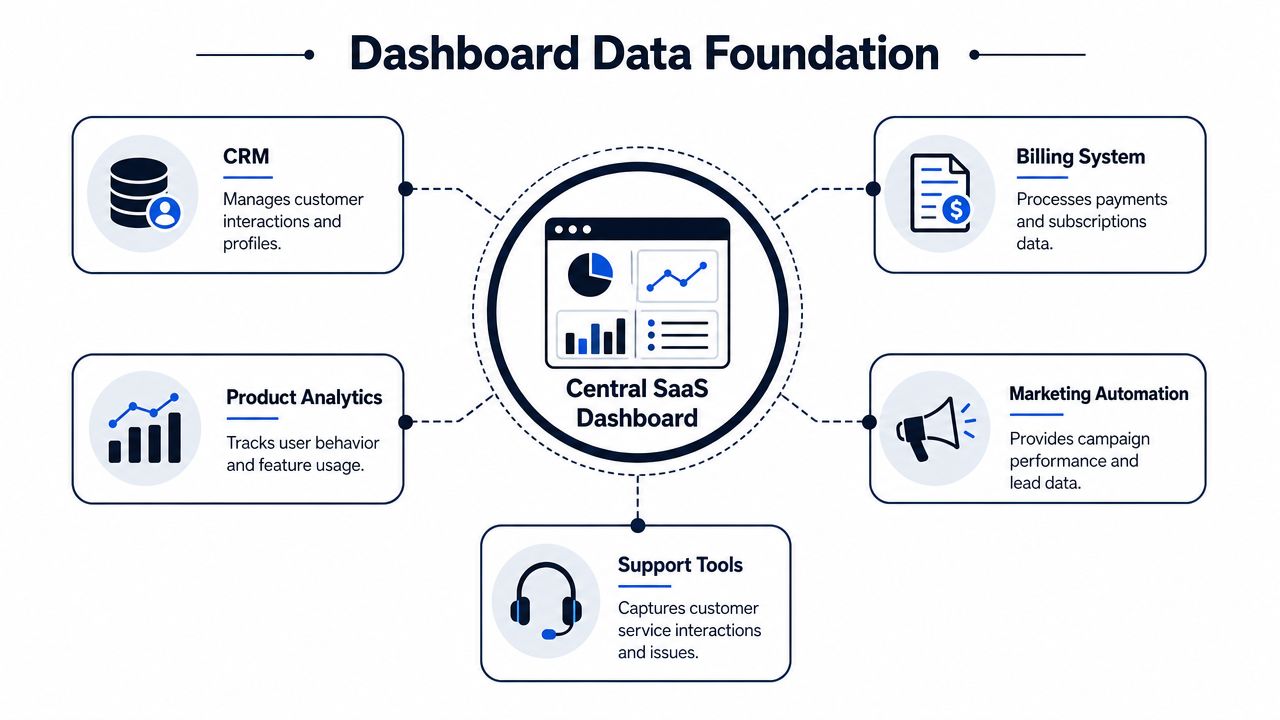
The systems you need to connect
A useful diagnostic dashboard usually pulls from four operational domains, plus a marketing layer in many cases.
- CRM: Salesforce or HubSpot gives you account ownership, plan details, pipeline context, renewal timing, and segmentation.
- Billing: Stripe, Chargebee, or Maxio gives you subscription state, upgrades, downgrades, expansion, and churn events.
- Product analytics: Mixpanel, Amplitude, PostHog, or warehouse-modeled events show activation, usage patterns, and feature adoption.
- Support and feedback: Zendesk, Intercom, Gong, and ticketing systems show where friction concentrates.
- Marketing automation: Marketo, Customer.io, or HubSpot campaigns help explain acquisition quality and lifecycle messaging effects.
If those systems don't share account identity cleanly, your dashboard will produce false confidence. The technical challenge isn't charting. It's identity resolution, event modeling, and trustworthy joins.
Fresh data changes behavior
Weekly batch updates sound acceptable until you need to act on a churn signal. By then, the customer success manager is already in a renewal conversation, product has already shipped the wrong fix, and leadership is debating stale numbers.
A healthy setup usually includes:
- Reliable source-of-truth ownership for each metric
- Clear event definitions for actions like activation, adoption, expansion, and churn risk
- Near-real-time syncs for operational decisions
- A modeled layer where business logic lives consistently
For teams building this foundation in-house, a solid data architecture diagram saves a lot of rework because it forces agreement on system boundaries and ownership before dashboards multiply.
If your dashboard updates slower than your customer problems develop, it's a history lesson.
When teams need warehouse depth and cross-system joins at scale, they often need implementation help. This directory of Expert Snowflake consulting rankings is a practical place to evaluate specialists if Snowflake sits at the center of your reporting stack.
One tool worth mentioning in this category is SigOS. It's designed to ingest support, chat, sales, and behavioral data, then correlate those signals with churn and expansion patterns. That's useful when your gap isn't metric collection, but turning fragmented qualitative and behavioral signals into an operational view.
Dashboard Design for Clarity and Action
Most dashboards fail in the last mile. The data is there. The team still doesn't act.
That usually comes down to design. Not visual polish. Decision design.

One dashboard is no dashboard
A single master dashboard sounds efficient and usually becomes unreadable. Executives, product managers, customer success leaders, and growth teams do not need the same screen.
Here's a better split:
| View | Primary question | What belongs there |
|---|---|---|
| Executive | Is the business healthy? | Revenue trend, churn shape, retention signals, major risk segments |
| Product | What product behavior predicts outcomes? | Activation, feature adoption, usage drop-offs, friction points |
| Customer success | Which accounts need attention now? | Health flags, support issues, adoption decline, renewal risk |
| Growth | Which inputs improve conversion and expansion? | Funnel quality, activation by segment, plan-level usage signals |
A dashboard should help the person looking at it take the next action. If it tries to serve everyone, it usually serves no one.
Good versus bad dashboard choices
Bad: Twelve KPI cards at the top, all screaming for attention in different colors.Good: One dominant trend, a few supporting diagnostics, and one clearly visible exception or alert.
Bad: Pie charts for everything.Good: Line charts for trends over time, bars for comparisons, tables for account-level triage.
Bad: Color used as decoration.Good: Color used sparingly to signal status, change, or exception.
Bad: Every metric on every page.Good: Progressive disclosure. Start with health. Then let users drill into cause.
Design for the thirty-second read
Someone should understand the dashboard fast. That means visual hierarchy has to do real work.
Use these rules:
- Put the most decision-relevant chart first: Not the prettiest chart. The one that answers the main question.
- Label metrics in business language: “Accounts with declining core feature usage” is better than “Feature event count.”
- Show comparison context: Current value alone is weak. Trend and segment context create meaning.
- Make exceptions obvious: If a segment is breaking, it should stand out without hunting.
This walkthrough is worth watching if you want practical examples of dashboard readability in action.
The best dashboard design removes explanation from the meeting because the layout already explains the problem.
Real-World Dashboards Uncovering Hidden Insights
A dashboard becomes valuable when it changes what a team does on Tuesday morning.
Scenario one churn risk shows up before the cancellation
A B2B SaaS company notices that churn is creeping up in one customer segment. If the team looks only at finance, they'll see a lagging result and start broad retention work. That's expensive and unfocused.
The better dashboard shows a more specific pattern. Accounts in that segment are using one workflow less often. Support tickets tied to that same workflow have also become more frequent and more urgent. Customer success notes show the same complaint surfacing in renewal calls.
Now the team has a usable diagnosis.
Product can inspect the workflow for regressions or usability issues. Support can tag and escalate the issue consistently. Customer success can proactively reach the affected cohort with targeted help instead of generic “checking in” emails.
The key move here is correlation. Not all usage declines matter. Not all ticket spikes matter. When the same feature, the same segment, and the same account cohort move together, the dashboard has found a pattern worth acting on.
Scenario two expansion hides inside usage patterns
Expansion opportunities often get missed because sales teams are forced to work from static account lists and anecdotal feedback.
A better dashboard surfaces lower-tier customers who are pushing hard against the boundaries of their current plan. Maybe a team has broad internal adoption, frequent use of a collaboration feature, and repeated interactions with functionality typically associated with a higher-value workflow. That doesn't guarantee an upgrade, but it's a much stronger starting point than sorting accounts by seat count alone.
A useful expansion view might include:
- Plan context: Which accounts are on entry-tier or mid-market packages
- Adoption depth: Whether use has spread beyond one champion
- Behavioral clues: Repeated use of premium-adjacent workflows
- Customer signals: Requests, support conversations, or sales notes indicating unmet needs
Product and revenue teams typically work more effectively when collaborating. Product sees behavior first. Sales sees commercial timing. Customer success sees stakeholder alignment. The dashboard gives them the same map.
What these examples have in common
Neither scenario depends on one heroic metric. Both depend on relationships.
- Behavior changes first
- Support or feedback validates the friction
- Revenue risk or expansion potential becomes visible
- A team gets a specific reason to act
That's the difference between a dashboard that decorates meetings and a dashboard that changes outcomes.
From Insights to Impact Operationalizing Your Data
If the dashboard ends with observation, it's unfinished.
The core job is turning a signal into a workflow. That's where many organizations still have a gap. They can see the problem. They haven't wired the response.
A simple operating loop
A practical model looks like this:
- Detect a meaningful patternAn account segment shows falling activation, dropping usage in a core workflow, or clustering support complaints.
- Classify the likely issueIs this onboarding friction, product quality, missing capability, or account-specific change management?
- Route the action to the right ownerProduct gets bugs and workflow friction. Customer success gets account recovery plays. Sales gets expansion candidates. Marketing gets lifecycle message gaps.
- Close the loopTrack whether the intervention changed behavior, stabilized the account, or improved retention signals.
That's the point where the dashboard stops being passive.
What operationalization looks like in practice
When a pattern crosses your internal threshold, the response should be automatic enough that nobody needs a meeting to start moving.
- Product workflow: Create a Jira or Linear issue with the affected segment, impacted workflow, and linked support evidence.
- Customer success workflow: Open a playbook in Salesforce or HubSpot for at-risk accounts, with talking points tied to the observed friction.
- Revenue workflow: Hand expansion-ready accounts to sales with evidence of adoption depth and premium-adjacent usage.
- Leadership workflow: Escalate only the issues that show real business impact, not every noisy spike.
A KPI template can help standardize that ownership model. This key performance indicator report template is useful if your current reporting still mixes metrics, commentary, and accountability in a loose way.
The discipline most teams skip
The hardest part isn't detecting patterns. It's agreeing in advance on what happens next.
Create a simple response table and keep it brutally clear:
| Signal | Likely owner | Immediate action |
|---|---|---|
| Activation decline in new cohort | Product and lifecycle | Review onboarding path and message timing |
| Drop in core feature usage for active accounts | Product and customer success | Investigate workflow friction and contact affected accounts |
| Support cluster around one feature | Product and support | Triage issue theme and prioritize fix |
| Premium-adjacent usage in lower-tier plan | Sales and customer success | Review expansion fit and outreach timing |
Dashboards create value only when the next action is obvious, assigned, and timely.
Done well, a SaaS metrics dashboard becomes part of daily operations. Product uses it to prioritize. Customer success uses it to intervene early. Sales uses it to qualify expansion. Finance uses it to validate whether those actions changed the business. That's when reporting becomes a system for execution instead of a ritual for explaining last month.
If your team is trying to connect support data, product behavior, and revenue impact in one operating view, SigOS is built for that use case. It analyzes behavioral and feedback signals together so product, growth, and customer teams can spot churn risk and expansion opportunities earlier, then route those insights into the tools they already use.
Keep Reading
More insights from our blog


Ready to find your hidden revenue leaks?
Start analyzing your customer feedback and discover insights that drive revenue.
Start Free Trial →