Using Sales Enablement Analytics to Drive Revenue Growth
Unlock revenue growth with sales enablement analytics. This guide explains key metrics, dashboards, and how to connect sales insights to your product roadmap.

A lot of SaaS teams are living the same week on repeat.
Sales says they just lost an important deal because a prospect needed one missing feature. Support says that feature isn't the core problem, because existing customers are flooding Zendesk and Intercom with complaints about a bug that blocks daily use. Product gets both messages, then tries to sort urgency from volume while the revenue team asks why pipeline is slipping.
That isn't just a prioritization problem. It's a data problem.
Most companies still treat sales conversations, support tickets, product usage, and CRM outcomes as separate streams. The result is familiar. Reps log anecdotal loss reasons. Product teams hear the loudest requests. Support teams escalate what feels urgent. Leadership gets dashboards full of activity, but not enough evidence about what drives revenue, prevents churn, or enables expansion.
The Disconnect Between Sales, Product, and Revenue
The hardest part of running revenue operations isn't collecting feedback. It's deciding which feedback matters.
One AE says a prospect demanded SSO. Another says buyers keep asking about integrations. Support leaders argue the primary churn risk comes from reliability issues, not roadmap gaps. Product managers look at all of it and still can't answer the question leadership truly cares about: which issue is costing us money right now?
That disconnect gets expensive fast. Teams ship features to satisfy one loud deal and ignore a recurring friction point that shows up across onboarding calls, support transcripts, and renewal conversations. Or they overreact to support volume without seeing that a different issue keeps surfacing in stalled mid-market deals.
What the old model misses
Traditional enablement reporting usually stays inside the sales org. It tracks content usage, training completion, call scores, and maybe win rates. Useful, but incomplete.
If your sales enablement analytics stop at rep performance, you miss the bigger pattern:
- Sales hears unmet demand before product sees it in roadmap planning.
- Support sees operational pain before success teams flag renewal risk.
- Growth sees messaging friction before conversion data makes the problem obvious.
- Product needs all three signals tied back to real opportunity and account outcomes.
That's why this discipline has expanded so quickly. Organizations that have embraced sales enablement reported a 343% increase in adoption over the last five years, and 90% of respondents said they now have a dedicated person, program, or function for it. Within 12 months of implementing sales enablement tools, 76% of organizations see a significant impact on sales performance, with revenue growth ranging between 6% and 20%, according to Learn to Win's sales enablement statistics roundup.
Sales enablement data becomes strategic when it stops answering only “Are reps prepared?” and starts answering “What should the business do next?”
The revenue signal is cross-functional
The companies getting real value from sales enablement analytics don't treat it as a coaching dashboard alone. They use it as a shared operating layer between sales, product, growth, and support.
That means listening for patterns across the entire customer journey. Which objections appear in lost deals and later show up in churn reasons? Which feature requests keep surfacing in large opportunities? Which bug mentions start in support and then appear in expansion risk conversations?
Once those signals are unified, prioritization gets cleaner. Teams stop arguing from anecdotes and start deciding from evidence.
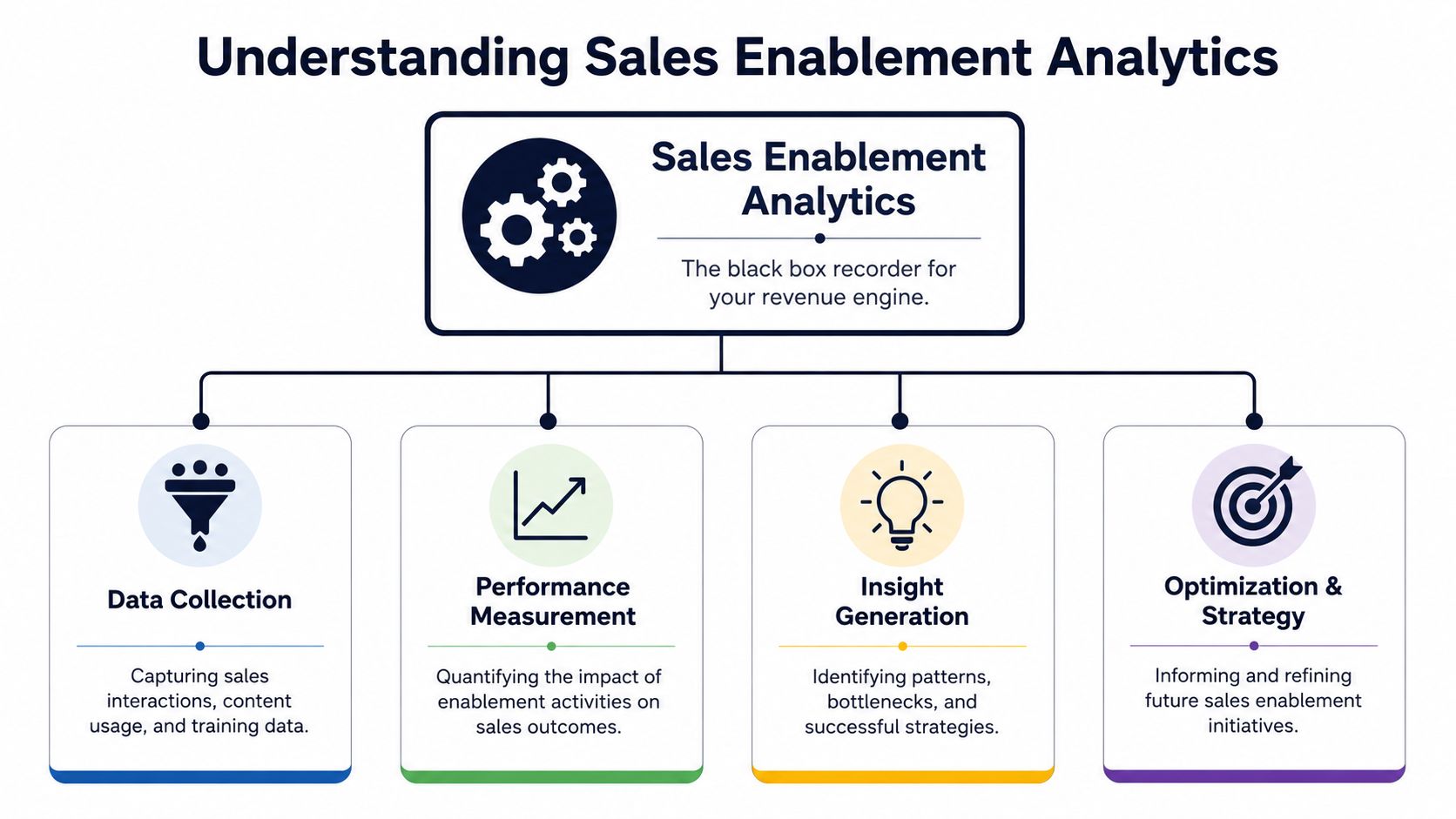
What Are Sales Enablement Analytics
The simplest way to think about sales enablement analytics is this. It's the black box recorder for your revenue engine.
A black box doesn't just tell you the final outcome. It captures what happened before the outcome, in sequence, with context. Sales enablement analytics work the same way. They record the inputs around sales performance so teams can connect what was said, shared, learned, and acted on to business results.
It starts with evidence, not activity
A weak enablement setup tells you how many calls reps made, how many pieces of content they sent, or who completed training.
A strong one tells you something more useful. Which content helped deals advance. Which training changed behavior in live conversations. Which buyer questions correlate with stronger opportunities. Which objections repeat in deals that stall, churn, or expand later.
That distinction matters. Activity metrics are easy to collect and easy to overvalue. Outcome-linked analytics are harder because they require clean joins across systems. CRM data has to line up with call data. Content interactions have to connect to stages and opportunities. Training signals have to show up in actual execution. Teams exploring scalable AI sales strategies usually run into this same reality quickly. The strategy is rarely the bottleneck. Data fragmentation is.
The three pillars that matter
Most mature sales enablement analytics programs rest on three pillars.
Content analytics
This pillar answers a blunt question. Are reps using the right material, and does it help?
That includes sales decks, one-pagers, battlecards, demos, case studies, pricing docs, and follow-up assets. Good content analytics show what gets used, when it gets used, and whether it appears in opportunities that move forward.
What doesn't work is measuring content libraries by volume. More assets usually create more confusion. What works is identifying the few pieces that repeatedly support progression in a given segment, stage, or objection pattern.
Readiness analytics
Readiness analytics connect training to performance. Not just course completion, but whether reps can apply what they learned under pressure.
Useful signals include certification outcomes, onboarding progression, manager assessments, and call reviews tied to live deals. If a rep passed training but still struggles with discovery or objection handling in actual calls, the readiness program didn't land.
Many teams are self-deceiving. Completion data looks clean. Behavior data tells the truth.
Behavioral analytics
Behavioral analytics examine what happens inside the conversation. That includes topics discussed, objections raised, competitor mentions, feature requests, buyer questions, and coaching signals from the rep side.
This is the most valuable pillar for cross-functional teams because it captures the raw voice of the customer. It also creates the bridge from sales execution to product, support, and growth decisions.
Practical rule: If your analytics can't connect conversation patterns to deal outcomes or account health, you're still measuring motion, not impact.
Key Metrics That Drive Business Decisions
When teams say they want better sales enablement analytics, they usually mean they want better dashboards. That's not quite right.
What they need is a metric set that helps different teams make better decisions. Product needs prioritization signals. Growth needs messaging and funnel signals. Support needs risk signals. Revenue leaders need to know which patterns impact pipeline and bookings.
The broad business case is already strong. Mature enablement programs that use analytics achieve a win rate of 78%, which is 12% higher than organizations without an enablement strategy. Those programs also report a 67% reduction in the length of the sales cycle and 37.9% more revenue generated, based on the 2025 sales enablement statistics compiled by Federico Presicci.
A usable metric set is built around decisions
Bad metric design starts with what's available. Good metric design starts with what a team must decide this quarter.
If product is trying to choose between fixing reliability issues or shipping a requested integration, the metric question is different from the one a growth team asks about conversion drag in enterprise deals. That sounds obvious, but many analytics programs still dump every KPI into one dashboard and call it alignment.
A better operating model is to organize metrics by business question.
Key Sales Enablement Metrics and Data Sources
| Metric | What It Measures | Primary Data Source(s) |
|---|---|---|
| Feature request velocity in won deals | How often a specific feature request appears in successful sales cycles | CRM, conversation intelligence, call transcripts |
| Feature request velocity in lost deals | Whether a missing capability repeatedly appears as a deal blocker | CRM loss reasons, call transcripts, AE notes |
| Objection recurrence by segment | Which objections surface most often by customer type, industry, or ACV band | Conversation intelligence, CRM, call summaries |
| Competitor mention rate | How often a named competitor enters active opportunities and renewals | Call transcripts, Gong-style call data, CRM notes |
| Content influence by stage | Which assets appear before progression from one stage to the next | Enablement platform, CRM, content system |
| Discovery quality score | Whether reps are uncovering pain, urgency, and buying criteria in a consistent way | Call review tools, manager scorecards, transcripts |
| Talk-to-listen balance | Whether reps leave enough room for buyers to reveal useful context | Conversation intelligence platforms |
| Question density | How consistently reps ask useful diagnostic questions in discovery and evaluation calls | Call transcripts, rep coaching tools |
| Bug mention trend | Whether a technical issue is surfacing across sales, support, and success conversations | Support platform, call transcripts, CS notes |
| Churn-risk topic frequency | Which topics repeatedly appear in accounts showing retention risk | Support tickets, renewal calls, customer success records |
| Expansion trigger themes | Which use cases or unmet needs show up before upsell or cross-sell motion | Account reviews, call transcripts, CRM opportunities |
| Time-to-first-value friction | Where implementation or onboarding pain appears in customer language | Support tickets, onboarding calls, product analytics |
| Message-market fit drift | Whether reps are forced to reframe positioning because the current narrative isn't landing | Discovery calls, demo calls, campaign feedback |
| Sales cycle stall reasons | The recurring themes in opportunities that stop progressing | CRM stage history, rep notes, transcript analysis |
For a deeper look at how teams build reporting around these kinds of KPIs, SigOS has a practical guide on metrics and reporting.
What to avoid
Some metrics feel useful because they're easy to graph. They still don't help anyone make a better decision.
Watch for these traps:
- Call count as a proxy for productivity. High volume can hide poor qualification.
- Content library size as a proxy for enablement maturity. More files often create more rep confusion.
- Training completion as a proxy for readiness. Finished modules don't guarantee field execution.
- A single global win rate. Without segment, stage, and objection context, it's too blunt to guide action.
The right metric set is narrower than commonly expected. It should be opinionated, tied to ownership, and close enough to the workflow that someone can act on it this week.
How to Build Your Analytics Architecture
Most companies don't fail at sales enablement analytics because they chose the wrong dashboard tool. They fail because the data lives in separate systems, with separate owners, using separate definitions.
Sales has CRM records and call recordings. Marketing owns content systems. Support runs Zendesk or Intercom. Product has Jira, Linear, GitHub, and usage data. If those systems don't connect, every analysis becomes a manual project. Manual projects don't scale.
Start with the minimum viable architecture
A usable architecture doesn't need to be elegant on day one. It needs to answer one business question reliably.
For most SaaS teams, the starting stack looks like this:
- CRM as the commercial source of truth for opportunities, account ownership, stages, and outcomes
- Conversation intelligence tooling for transcripts, call topics, objections, and buyer language
- Support systems for ticket themes, bug reports, and customer friction
- Product delivery systems like Linear, Jira, or GitHub for issue tracking and roadmap linkage
- A unifying analysis layer that can tie those signals back to revenue, churn risk, and expansion patterns
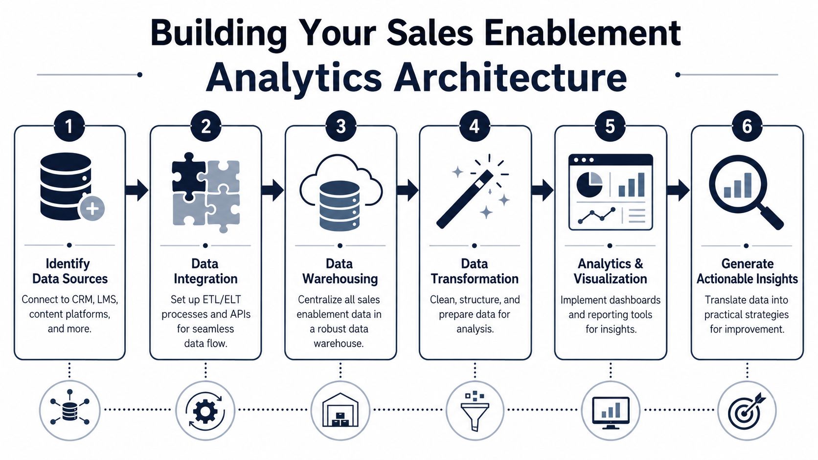
The common mistake is trying to centralize everything before anyone has defined the decision logic. Don't start with a warehouse schema debate. Start with one use case, such as “Which product issues appear in both lost deals and churn-risk accounts?”
A phased roadmap works better than a full rebuild
I've seen more progress from phased rollouts than from grand transformation plans.
Phase one
Connect CRM and call data. At this stage, the goal is basic visibility into which themes appear in won and lost deals. Even simple tagging is useful if the taxonomy is consistent.
Phase two
Add support and customer success data, allowing teams to begin to see whether pre-sale objections become post-sale friction. Once that loop closes, roadmap discussions change fast.
Phase three
Layer in content and readiness signals. Now you can test whether certain assets, messaging, or training patterns correlate with opportunity progression.
Phase four
Automate the analysis layer. At this layer, AI starts paying for itself. Instead of asking analysts to read calls, classify tickets, and reconcile issues manually, the system surfaces patterns continuously.
The architecture matters less than the join logic. If you can't connect customer language to account outcomes, the stack stays impressive and unhelpful.
Expect messy data and plan around it
This part is never clean. CRM fields are inconsistent. Reps log loss reasons differently. Support tickets mix bugs, confusion, and feature requests. Product issue titles aren't written for analytics. That's normal.
The answer isn't to wait for perfect hygiene. It's to design for imperfection. Use controlled taxonomies where you can. Keep business definitions tight. Review outputs with real operators, not just analysts.
Some teams also enrich account and firmographic records before they build cross-system views. If you're pulling supplemental company data from public sources or fragmented databases, no-code scraping tools can help fill gaps without creating another engineering dependency.
For teams thinking through the data flow itself, this breakdown of a data architecture diagram is a useful reference point.
Dashboards and Use Cases for SaaS Teams
Dashboards only matter if a team changes behavior because of them.
The strongest sales enablement analytics programs I've seen all share one trait. Their dashboards are built for decisions, not status reporting. Product uses them to change roadmap order. Growth uses them to tighten messaging and campaign targeting. Support uses them to intervene before accounts deteriorate.
Here's what that looks like in practice.
Product team dashboard
A product team usually gets feedback in three incompatible forms. Sales sends anecdotal request summaries. Support forwards ticket clusters. Leadership relays escalations from strategic accounts.
A more useful dashboard groups customer language by theme and ties each theme to commercial impact. One panel shows recurring feature requests in active opportunities. Another shows bug mentions in expansion-risk accounts. A third isolates issues that appear in both sales calls and support tickets.
That changes the roadmap discussion. Instead of debating whether a request is “important,” product can ask a better question: does this issue appear across valuable opportunities and existing customer risk?
A strong product-facing dashboard often includes:
- Revenue-linked request themes tied to open opportunities and account stage
- Cross-source issue clustering from sales calls, support transcripts, and success notes
- Urgency signals based on repetition, escalation language, and account context
- Delivery linkage into Jira, Linear, or GitHub so evidence connects to execution
The most underserved angle in sales enablement analytics is still the link between micro-behaviors and business outcomes. As noted in Allego's discussion of sales enablement metrics, platforms can measure rep behaviors like talk-to-listen ratios, but teams still struggle to model how those shifts map directly to revenue outcomes. That matters for product too. If discovery quality is weak, the feature data entering roadmap discussions is weak.
Growth team dashboard
Growth teams often inherit messaging from sales decks, campaign performance, and market feedback, but rarely in one place. That leaves them reacting after conversion drops instead of spotting message friction early.
A useful growth dashboard connects call themes to funnel behavior. If enterprise buyers repeatedly ask the same clarifying question during demos, that's a signal the positioning is muddy. If reps keep sending the same battlecard or integration explainer before deals advance, that's a content influence signal worth amplifying in campaigns and lifecycle programs.
I also like adding account enrichment to this view so the growth team can compare objections and content needs by segment. Teams already using Webclaw lead enrichment solutions for cleaner account profiles can make those comparisons more precise because segment labels and account context are less brittle.
A growth dashboard should help answer questions like:
- Which buyer concerns appear before stage progression
- Which messages need repeated clarification
- Which content assists movement in larger or slower deals
- Which segments experience the most positioning friction
For teams designing these reporting views, a practical reference is this guide to a dashboard for metrics.
Good growth reporting doesn't just show conversion rates. It shows the language buyers need before they trust your story.
Support and success dashboard
Support teams usually see problems before finance does.
The issue is that support data often gets trapped as operational volume. Ticket count tells you workload. It doesn't tell you whether a bug is becoming a churn pattern, whether a competitor is entering renewal conversations, or whether a confusing workflow is blocking expansion.
A support-facing dashboard should surface issue themes that spread across touchpoints. If a bug appears in tickets, then in QBR notes, then in renewal calls, that's not just support load. That's account risk.
A strong dashboard for support and success includes recurring complaint themes, severity language, linked open opportunities inside existing accounts, and renewal timing. The best versions also track when a supposedly “small” issue starts showing up in pre-sale evaluation calls. That is often the point where product debt turns into pipeline drag.
A short product walkthrough helps make the cross-functional use case concrete:
When these dashboards work, teams stop escalating isolated anecdotes and start escalating proven patterns.
Best Practices and Common Pitfalls to Avoid
Most sales enablement analytics programs don't break because of bad intent. They break because teams collect too much, define too little, and connect almost nothing.
A few habits make the difference.
Best practices that hold up
- Start with one revenue question. Don't begin with dashboard templates. Begin with a decision, such as which issue is blocking the most valuable opportunities.
- Use shared definitions across teams. If sales, product, and support define “feature request,” “bug,” and “churn risk” differently, your reporting will drift immediately.
- Treat conversation data as strategic input. Call transcripts, support chats, and CSM notes often reveal demand shifts before formal reporting does.
- Build for workflow adoption. Insights need to reach the people who can act. Product managers need issue evidence where they plan. Sales managers need behavior signals where they coach.
- Use automation for pattern detection. Manual review can uncover insight, but it won't keep pace with live pipeline, active accounts, and incoming support volume.
Pitfalls I see repeatedly
Vanity metrics dressed up as strategy
Teams still spend too much time on call volume, training completion, and content counts. Those aren't worthless. They're just weak proxies if they aren't linked to outcomes.
Analysis paralysis
Once data starts flowing, the temptation is to measure everything. That creates reporting density without operational clarity. A smaller metric set with real ownership beats a giant dashboard no one trusts.
Ignoring qualitative evidence
The best signal often arrives as messy language. A buyer objection, a renewal complaint, a rep note, a frustrated support transcript. If your system only respects structured fields, you'll miss the evidence that matters first.
Keeping enablement trapped inside sales
The moment sales enablement analytics become visible to product, growth, and support, the function gets more valuable. The moment it stays isolated as a coaching report, the business leaves value on the table.
The point isn't to build prettier dashboards. It's to give the business a reliable way to translate customer language into revenue decisions.
Sales enablement analytics are at their best when they stop being a sales-only reporting layer and become a shared intelligence system for the company.
If your team is trying to connect sales calls, support tickets, and product signals without adding another manual analysis project, SigOS is built for that job. It helps SaaS teams identify which issues and requests correlate with churn, expansion, and revenue impact so product, growth, and support can prioritize from evidence instead of noise.
Keep Reading
More insights from our blog


Ready to find your hidden revenue leaks?
Start analyzing your customer feedback and discover insights that drive revenue.
Start Free Trial →