User Engagement Metrics: The 2026 SaaS Playbook
Track the user engagement metrics that matter, measure them accurately, and link them to churn and growth outcomes.

Only 25% of users return the next day, and about 6% are still active by day 30 across consumer apps. That decay curve is the primary reason SaaS teams need user engagement metrics that measure repeated value, not just first-time attention.
Teams can get signups. The harder job is proving that a product keeps creating value after the novelty wears off. Once you look at engagement through that lens, DAU stops being a finish line and starts looking like one symptom in a much larger system.
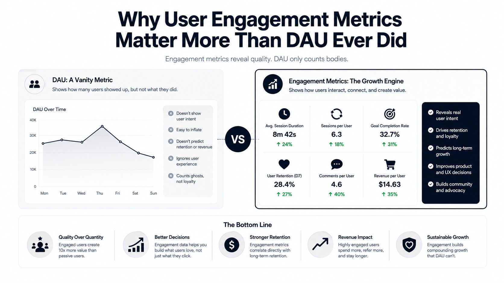
Why User Engagement Metrics Matter More Than DAU Ever Did
DAU can rise while the product weakens. That happens when acquisition outpaces activation, or when users open the app but don't reach anything meaningful. The benchmark data makes that risk obvious, because a global consumer-app average of 25% Day 1 retention, 10.7% Day 7 retention, and 6% Day 30 retention shows how fast interest decays after the first visit. Those figures come from a 2026 industry summary on retention benchmarking, and they're a reminder that raw traffic doesn't equal durable value. Retention benchmarking data
The shift from counting visits to tracking cohorts
That retention curve is also why the field moved from simple traffic counting to cohort-based retention tracking. Once product teams started following groups of users over time, the question changed from “How many showed up?” to “How many came back, found value, and formed a habit?” That's a much better question for SaaS, because paid products live or die on repeat use.
DAU is still useful, but only when you read it alongside activation and retention. A rising DAU can hide the fact that new users are stalling before they ever experience the core value of the product. In practice, that means a healthy-looking dashboard can still mask churn risk, weak onboarding, or a feature set that's getting attention without becoming part of anyone's workflow.
Practical rule: If your usage volume is growing but retention is flat or falling, assume the product is attracting attention faster than it's creating habit.
Why this matters for daily product decisions
For a PM, the implication is straightforward. You don't want to celebrate a busy dashboard if the users behind it aren't progressing through value. You want a metric system that tells you whether people are reaching activation, adopting the right features, and returning because the product is now part of their work.
That's why user engagement metrics matter more than DAU ever did. They help you separate noise from signal, and signal from revenue. A product can get lots of visits and still fail the only question that really matters, which is whether customers keep coming back because the product is worth their time.
The Core User Engagement Metrics Every SaaS Team Should Track
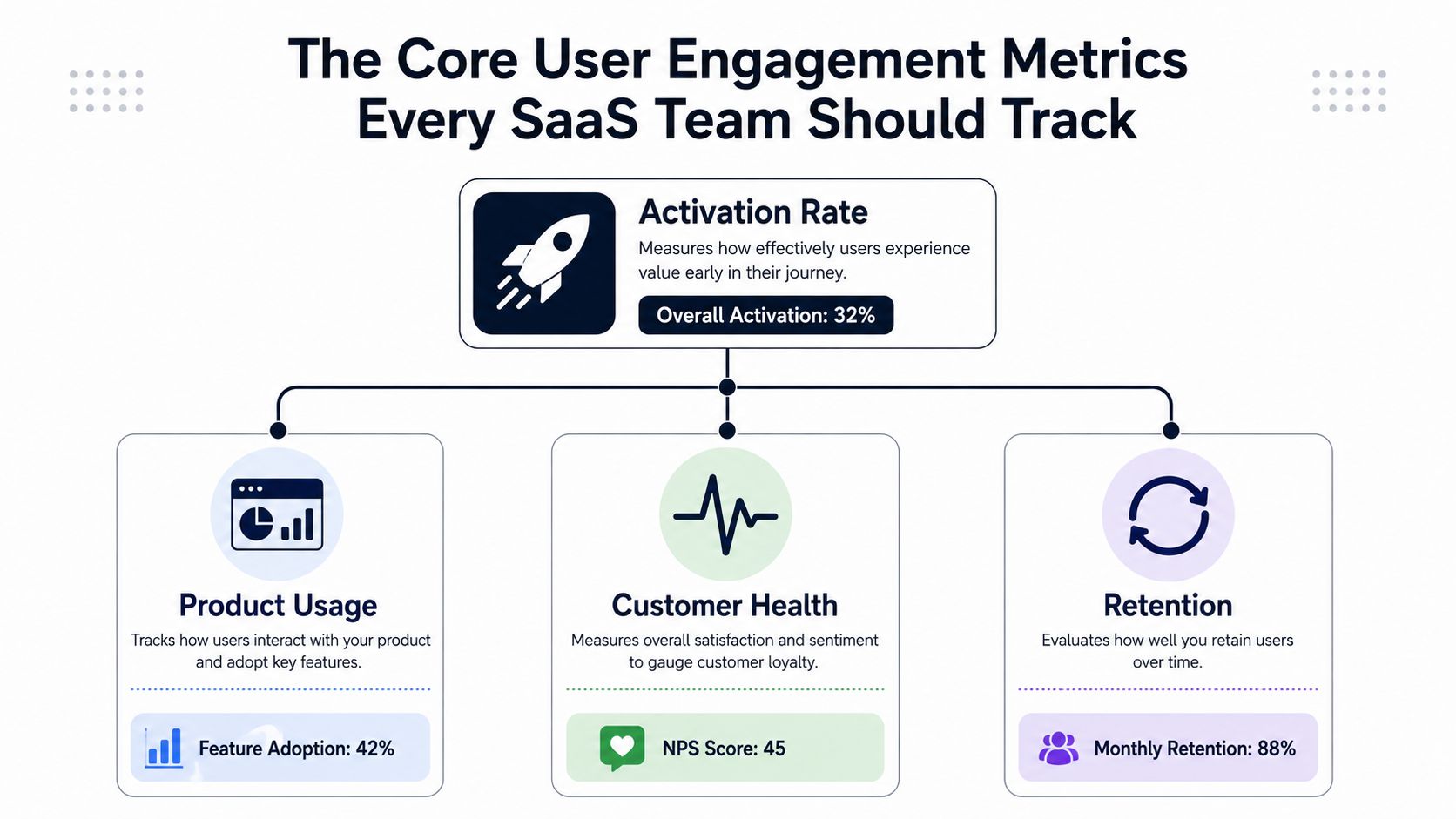
The cleanest way to think about user engagement metrics is as a hierarchy, not a pile of dashboard widgets. The top of that hierarchy is activation rate, because it tells you how many new users reach their first meaningful value moment. In the Appcues guide, a typical activation benchmark sits in the 25%–40% range, which is why activation is such a strong early warning signal when it slips. Appcues engagement metrics guide
Start with activation, then follow the chain
Activation answers a simple question. Did the user get to the part of the product that makes them say, “Now I get it”? For a project tool, that might be creating the first project. For an analytics tool, it might be connecting a data source. If users don't reach that point, the rest of the funnel is already weakened.
From there, feature adoption rate tells you whether users are moving beyond the first win and using what you built. A common benchmark for core features is 20%–30%, which is useful as a starting point, not a universal target. Adoption matters because it shows whether the product is becoming useful in more than one moment of the workflow.
DAU/MAU ratio then tells you whether the product is becoming a habit. In many B2B products, a 10%–25% stickiness range is often used as a practical reference point, because most business tools aren't meant to be opened every hour. Average session duration adds depth, but only when you interpret it carefully. More time can mean more engagement, or it can mean friction, so you have to pair it with completion metrics.
A long session is not automatically a good session. If users are lingering because they're confused, the metric is telling you to simplify the workflow, not celebrate the time spent.
The business-facing metrics complete the picture
Customer retention rate shows whether engagement is holding over time. Conversion rate connects product activity to revenue, with Appcues noting that self-serve trial-to-paid motion often lands in the 3%–5% range, while sales-assisted motion is commonly 15%–25%. Finally, NPS gives you a sentiment layer, and the same guide cites a SaaS-average NPS of 30–40 as a common reference point.
When you read these metrics together, the sequence becomes clear. Activation feeds adoption, adoption drives stickiness, and stickiness supports retention and monetization. That's the value of the framework. It tells you where the funnel is breaking, so you can decide whether to fix onboarding, improve a feature, or adjust the pricing path.
How to Measure User Engagement Metrics Correctly
Good measurement starts with a definition, not a dashboard. If you can't say exactly what counts as meaningful engagement, every downstream number gets fuzzy. That's why the most important operational move is to define the event that represents value in your product, then build everything else around it.
Get the event model right
The most useful metric work usually begins with a funnel. Gainsight recommends tracking Funnel Completion Rate and Funnel Average Time to Complete as core user-journey measures, because they show whether users reach the value moment and how much effort it takes. When completion falls and time rises, the likely causes are pretty familiar, excessive steps, unclear UI cues, or a slow backend in a critical path. Gainsight product engagement metrics
That logic matters because it tells you where to look before you start changing the product. A low completion rate doesn't automatically mean the feature is bad. It can mean the experience is hard to understand, or the workflow asks for too much too soon.
Centralize data before you compare metrics
Once the event definition is clear, the next challenge is source alignment. Product analytics might tell you what people did in the app, CRM data shows who the account belongs to, and billing data tells you whether the account converted. If those systems aren't reconciled, you'll end up measuring the wrong cohort or misreading the outcome.
That's where per-account analysis becomes important for multi-seat SaaS. A single user might look inactive while the account is healthy, or one power user might distort the average for an entire team. Measuring on a per-account basis gives you a more realistic view of whether the product is being adopted across the customer, not just by one enthusiastic user.
Avoid the common measurement traps
A 30-day aggregate can hide cohort problems. New users may be failing while older customers remain stable, which means the average looks fine even though onboarding is breaking. That's why trend lines and cohort cuts matter more than snapshots.
The simplest way to keep the work disciplined is to use a repeatable path from event to analysis. A practical reference on instrumentation and usage tracking is available in SigOS's guide to tracking app usage, and the same discipline applies whether you're measuring activation, feature depth, or retention.
Measurement standard: If a metric can't be tied to a defined event, a known data source, and a specific cohort, it's not ready for decision-making.
Prioritizing Engagement Metrics for Your SaaS Business Model
Not every product should care about the same engagement signals. A self-serve PLG product needs to know whether new users are reaching value and converting. An enterprise product often needs to understand how thoroughly an account is embedding the workflow across seats and teams. The dashboard should reflect that difference, or it'll blur the decisions that matter.
Match metrics to the motion
In a self-serve motion, activation rate and trial-to-paid conversion are usually the first two numbers to watch closely, because they show whether users are getting to value without sales intervention. In a deal-driven enterprise motion, account stickiness, feature depth, and retention by account matter more than raw login volume. The product may be used less frequently, but the usage pattern can still be highly valuable if it spreads across the buying group.
This is also where stage matters. Early-stage teams should care more about whether users reach the aha moment and discover the core feature set. Mature SaaS teams should care more about whether usage is stable, whether adoption broadens across the account, and whether the patterns point to expansion rather than churn.
Use a revenue filter for every new metric
The easiest way to keep a dashboard lean is to ask one question whenever someone proposes a new metric. Does this signal connect to revenue, churn risk, or expansion potential? If it doesn't, it probably belongs in a research view, not the executive dashboard.
That filter matters because teams can drown in attractive but weak numbers. Session count, page views, and login volume can be useful in context, but they often fail the test of actionability. A high-performing PM doesn't just collect metrics, they prune them until the remaining set maps to a decision.
Don't optimize for the wrong kind of activity
A product with low-frequency but high-value use should not chase the same rhythm as a communication tool. The right target depends on the product's job. If the product is supposed to support weekly planning, then a daily activity target may be misleading. If the product is meant to be woven into daily operations, then a monthly cadence would understate adoption.
The point is simple. Prioritization has to start with the business model, or you'll spend time improving the wrong behaviors.
The Hidden Shift Human and AI Agent Engagement in 2026
Most engagement playbooks still assume a human user is doing all the work. That assumption is getting weaker. Userpilot's 2026 framing separates human engagement, meaning clicks, sessions, feature adoption, and NPS, from AI agent engagement, meaning task completion, outcome quality, and handoff behavior. That shift changes how product teams should interpret activity, because a higher DAU no longer proves that the customer themselves is doing more work. Userpilot on user engagement
A rising DAU can mean less human effort
If an AI agent resolves a support queue, drafts a follow-up email, or generates a weekly report, the human user may show up less often while the customer experience improves. That's exactly why old DAU-centric thinking starts to break. The product can be more useful even when the person clicks less, because the system is doing more of the repetitive work.
A support workflow is a good example. If an AI agent handles routine tickets, the metric that matters isn't just how many users return to the interface. It's whether the agent completes the task reliably, whether the output is accurate enough to trust, and whether humans intervene only when they should.
Separate human value from machine-assisted completion
Teams need two measurement layers now. One layer should tell you whether humans are finding value, learning the product, and adopting the core workflow. The other should tell you whether the agent is completing the job with the right quality and the right handoff points.
If you want a practical lens on how AI changes customer interaction patterns, Halo AI's discussion of AI powered customer engagement is a useful adjacent read. The main lesson is that engagement is no longer just about activity volume, it's about who, or what, completed the work and whether the outcome was good.
A useful internal reference for teams building around this shift is SigOS's guide to AI for product development. It helps frame the product questions that show up once AI participation becomes part of the workflow.
Why this matters for SaaS leadership
The risk is obvious. If you only watch human activity, you can misread automation as disengagement. If you only watch machine output, you can miss whether the customer still understands and trusts the product. The strongest teams will measure both, then compare them against the outcome they're trying to create.
Linking Engagement Signals to Churn and Expansion Risk
User engagement metrics become useful when they help a team see revenue risk while there is still time to respond. A decline in stickiness, a drop in feature adoption after a release, or longer sessions paired with weaker conversion each points to a different kind of problem. Those patterns matter because they often surface churn or expansion signals before the finance report does.
Read the signals as directional clues
A falling DAU/MAU ratio inside a specific segment usually deserves attention before a broad retention number does. It often means the product is slipping out of the customer's routine, like a tool that used to sit on the desk and now stays in the drawer. A drop in core feature adoption after a product update can mean users find the change less useful, or harder to understand, than the version they used before.
Rising session duration with falling conversion is a different signal. At first glance, it can look like healthy engagement. In practice, it often means users are searching rather than succeeding. They are spending more time because the workflow is unclear or the value moment is buried too deep.
Use lifecycle context, not isolated metrics
Engagement becomes more useful when you place it next to the account's stage in the journey. A new account that is not adopting core features is a churn candidate. A mature account that expands feature use across more users is a candidate for upsell or broader rollout. For a clear framing of this progression, customer lifecycle stages and metrics pairs well with engagement analysis.
That lifecycle view also keeps teams from overreacting. A temporary dip in activity after onboarding may not mean risk if the customer is still moving through setup. The question is whether the behavior fits the stage, not whether activity moved in isolation.
How SigOS turns patterns into action
At SigOS, continuous behavioral analysis ingests support tickets, chat transcripts, sales calls, and usage metrics, then surfaces patterns that correlate with churn, expansion, and revenue impact. The platform's morning dashboard highlights the issues costing real money and the feature requests most likely to drive six-figure deals, while integrations with Zendesk, Intercom, Linear, Jira, and GitHub can create issues with revenue impact scores. It also sends real-time alerts for emergent churn patterns and reports 87% correlation accuracy with sub-minute analysis times. SigOS platform
That kind of workflow matters because it closes the loop between observation and action. Engagement stops being a retrospective report and becomes an operating signal. Teams can see which behaviors precede churn, which ones precede expansion, and which ones are just noise.
You can go deeper on the predictive side with SigOS's guide to predictive churn modeling, especially if you want to connect behavioral patterns to account-level risk before customers leave.
How to Build an Actionable Engagement Measurement Workflow
A workable system doesn't start with tools. It starts with a definition of activation, then adds just enough instrumentation to make the signal visible. After that, the job is to keep the measurement tight, tie it to a business outcome, and review it often enough that the team can still act on it.
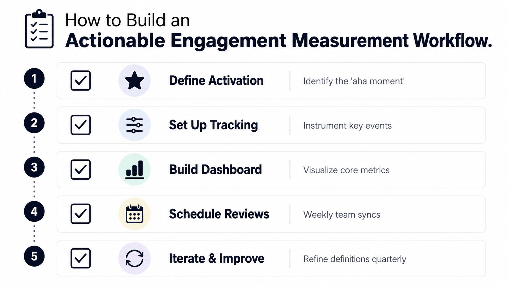
Build the workflow in five moves
- Define activation. Pick the moment when a new user first experiences core value. If the team can't describe that moment clearly, the rest of the funnel will stay fuzzy.
- Set up tracking. Instrument the key events that lead to activation, adoption, and conversion. Use product analytics to capture behavior, then tie those events back to account and billing data.
- Build a small dashboard. Keep it focused on the metrics that map to your business model. Three or four strong signals are more useful than a page full of weak ones.
- Schedule weekly reviews. A metric only matters if the team discusses it. Weekly review keeps the signal fresh and makes it easier to respond before a problem becomes a pattern.
- Iterate on the definitions. As the product changes, the meaning of activation or adoption may shift. Revisit the definitions quarterly so the numbers still reflect real user value.
Operational rule: If a metric changes and nobody knows what action should follow, the metric is too vague for the dashboard.
Use automation where the pattern is repetitive
Manual review works for small volume, but it doesn't scale. Automated alerts and pattern detection help product teams notice changes in engagement before they become obvious in revenue data. That's where product-intelligence systems become useful, especially when they can connect usage changes to support, sales, and issue-tracking signals.
If you're building that kind of operating model for clients or multi-account workflows, Crowbert's guide for agencies on engagement is a useful adjacent reference. The logic is the same, identify the behaviors that matter, then create a response that doesn't depend on someone noticing the problem late.
Turn the dashboard into action
A good workflow ends with a named response. If feature adoption drops in one account cohort, customer success should know who to contact. If activation falls after a release, product should know which event path to inspect. If an emerging pattern looks like churn risk, the team should already have a way to route it into outreach or a product fix.
That's the difference between measurement and management. Measurement tells you what happened. Management changes what happens next.
SigOS helps product teams turn noisy behavioral data into engagement signals they can act on. If you want a system that connects usage, support, and revenue impact in one place, visit SigOS and see how it can help you prioritize the metrics that predict churn and expansion.
Keep Reading
More insights from our blog

Ready to find your hidden revenue leaks?
Start analyzing your customer feedback and discover insights that drive revenue.
Start Free Trial →